Evans’ iphone app
Redressing the Evans app
Created a fresh interface design concept prioritising ease of use and reachability on mobile devices while maximising usage of screen area.
UI concept for Evans’ iOS app
Evans’ iphone app
Redressing the Evans app
Created a fresh interface design concept prioritising ease of use and reachability on mobile devices while maximising usage of screen area.
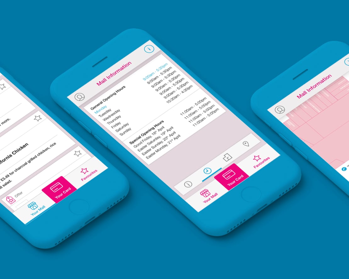
UI concept for Evans’ iOS app, 2014
Brief
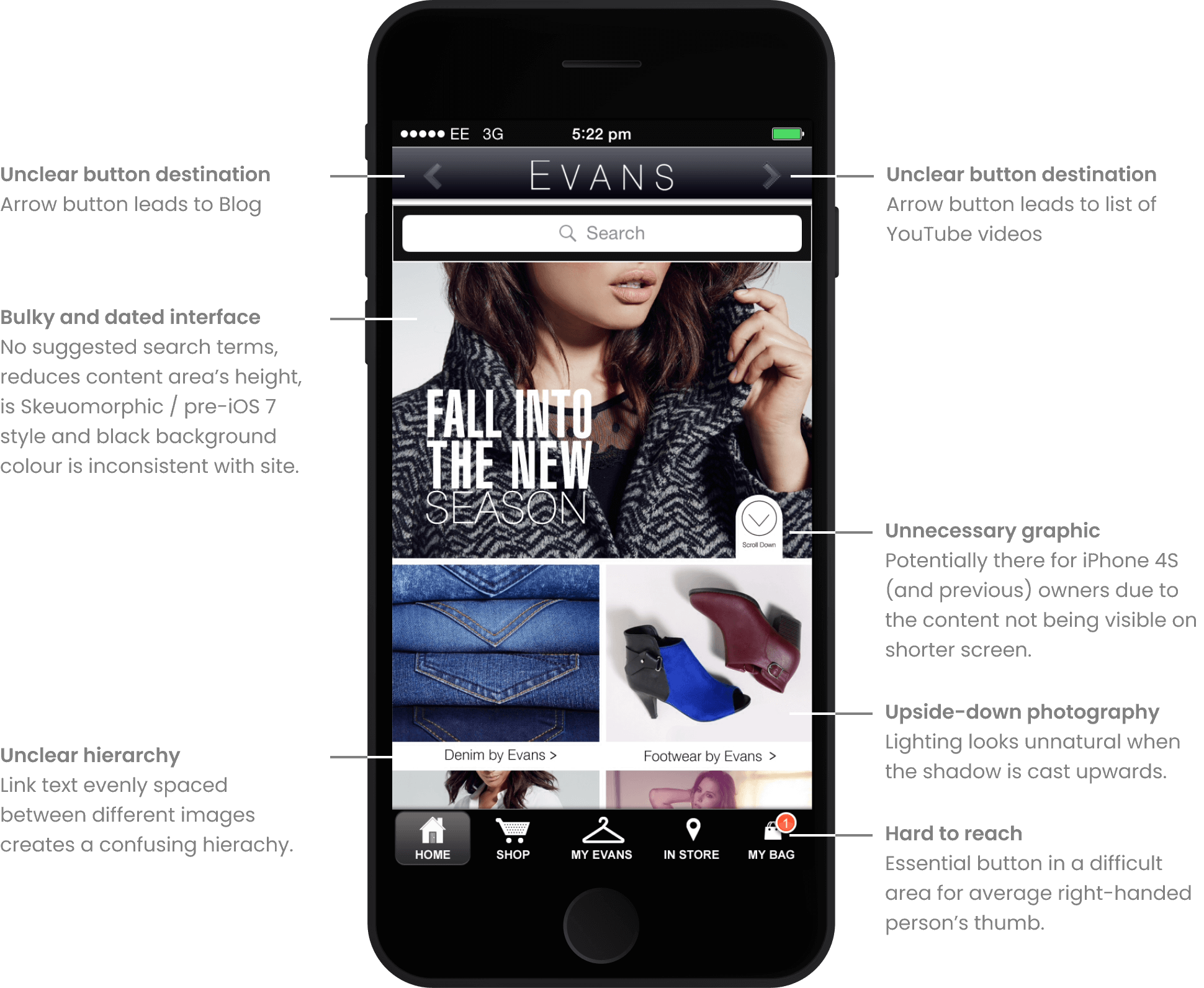
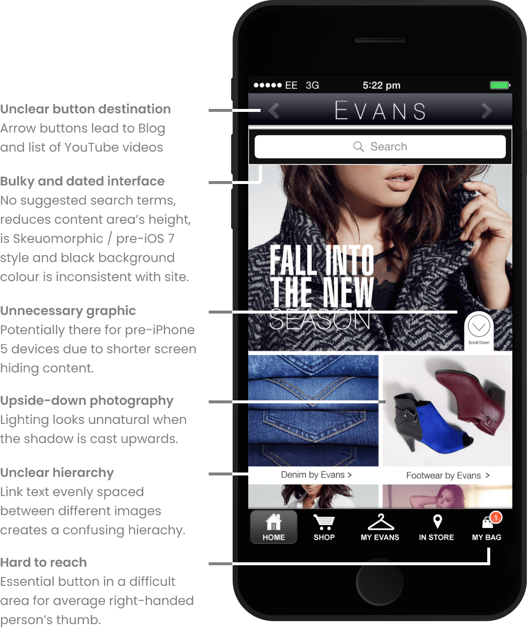
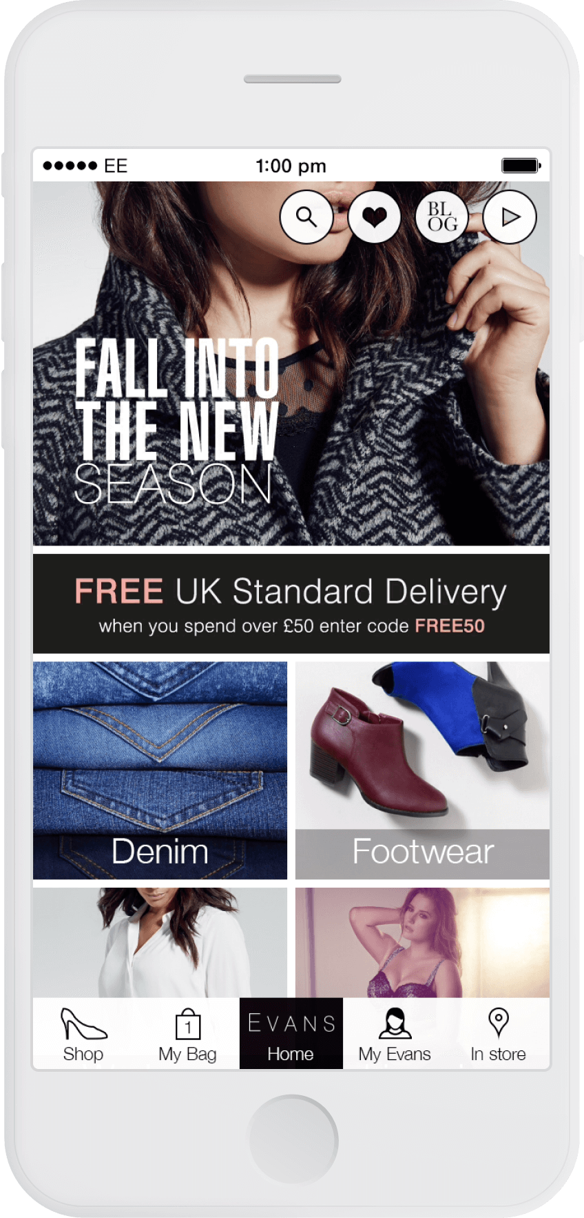
In preparation for a job interview, I took it upon myself give the Evans app a much-needed refresh. With the arrival of iOS 7, skeuomorphic design was out and flat design was in.
Analysis
I identified a number of visual issues that could be easily fixed while still using Evans’ existing content.
Analysis
I identified a number of visual issues that could be easily fixed while still using Evans’ existing content.
Competitor research
During my research I explored apps by H&M, Pull & Bear and Zara, all of which had a layout and style in-keeping with iOS 7 and modern design trends – flat.
H&M maximise screen space by displaying the most amount of content in the initial view.
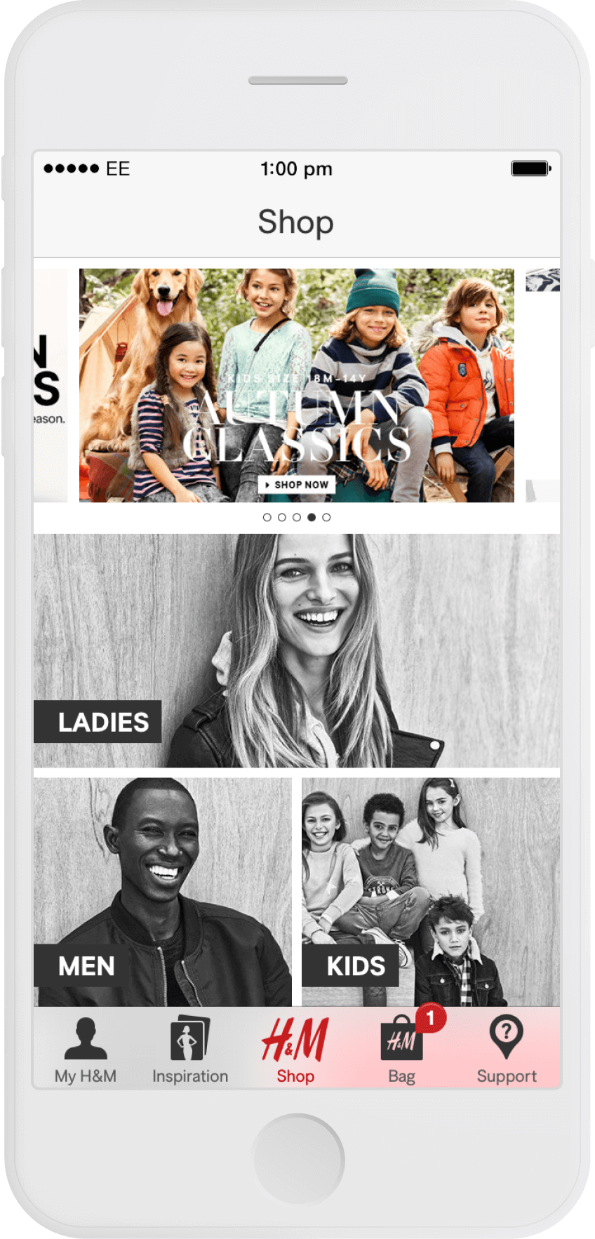
H&M
While the logo is visible in all three apps, I felt H&M’s choice of position is best as it is present but doesn’t waste valuable space. It simply acts as a reminder of which app the person is using.
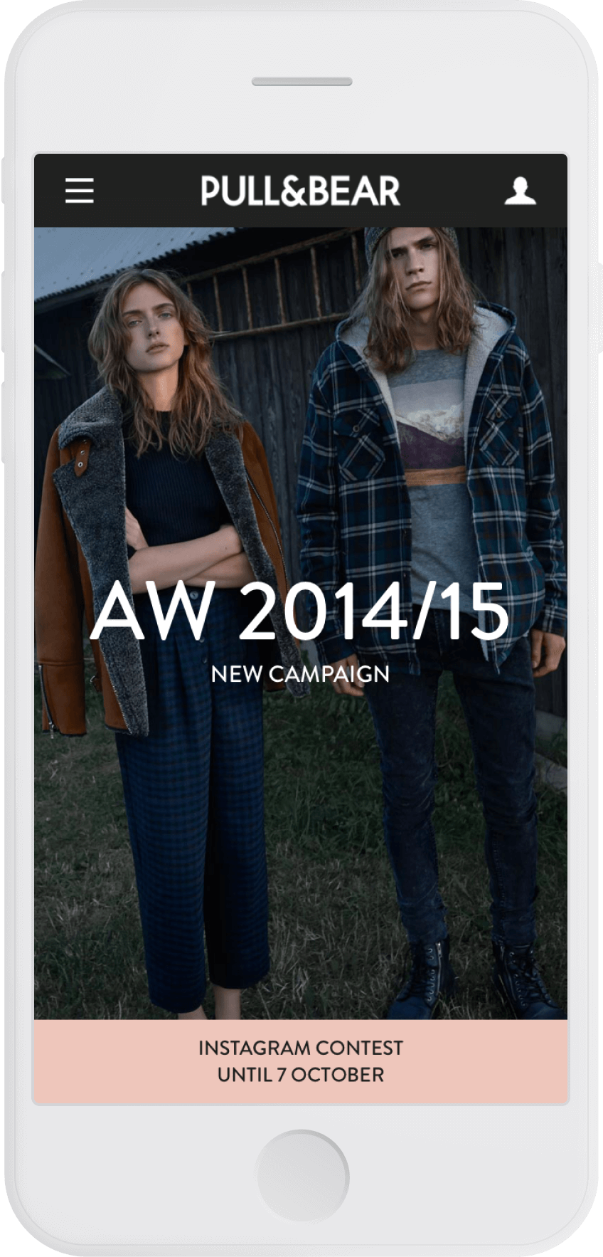
Pull & Bear
All three apps opted for an icon in the form of a person's silhouette to embellish their ‘My...’ buttons, giving clear indication that the section it opens contains personal information.
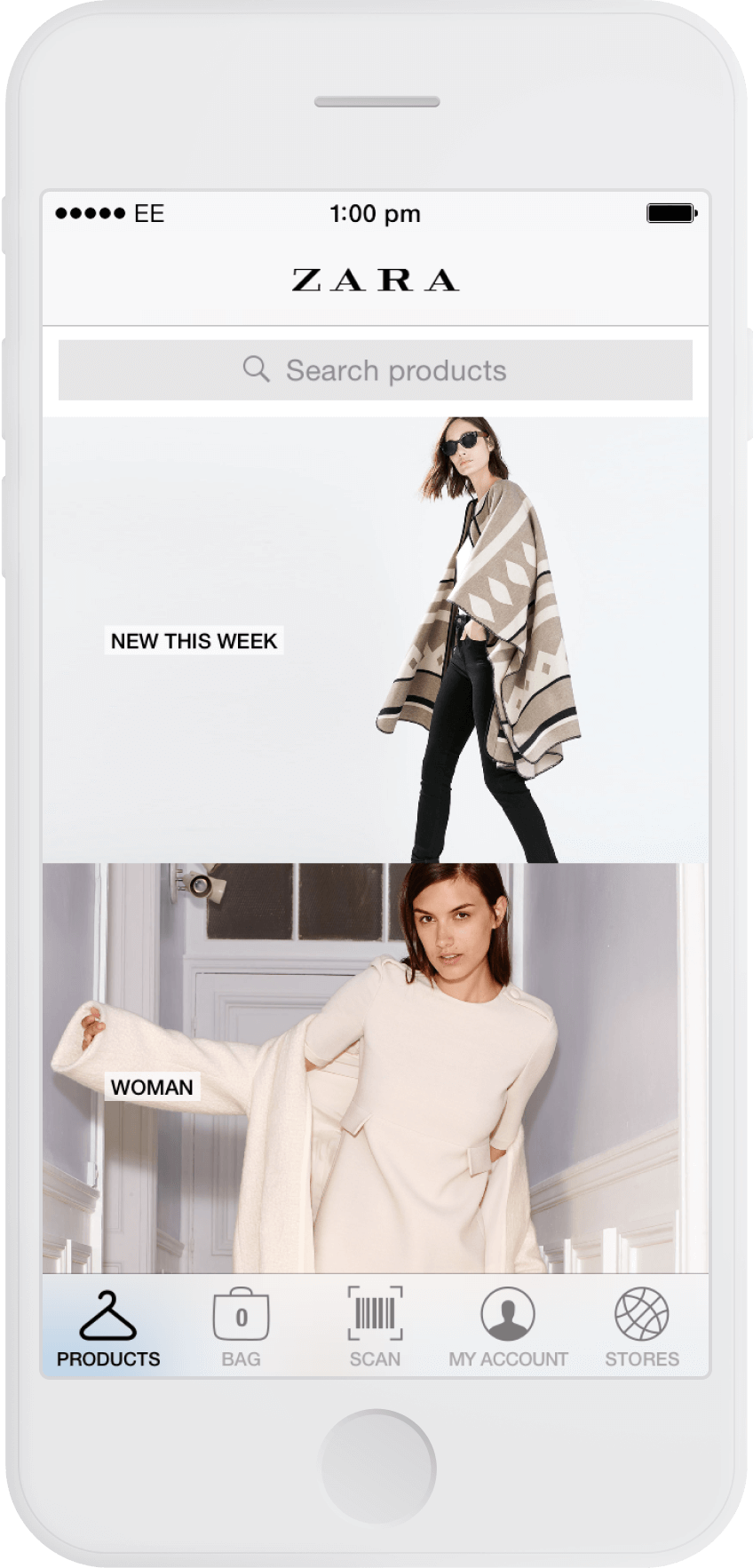
Zara
The space within the ‘bag’ icon is cleverly utilised to neatly display the number of items within it. The most commonly used buttons – ‘products’ and ‘bag’ – are located in the most comfortable position for a right-handed person.
Result
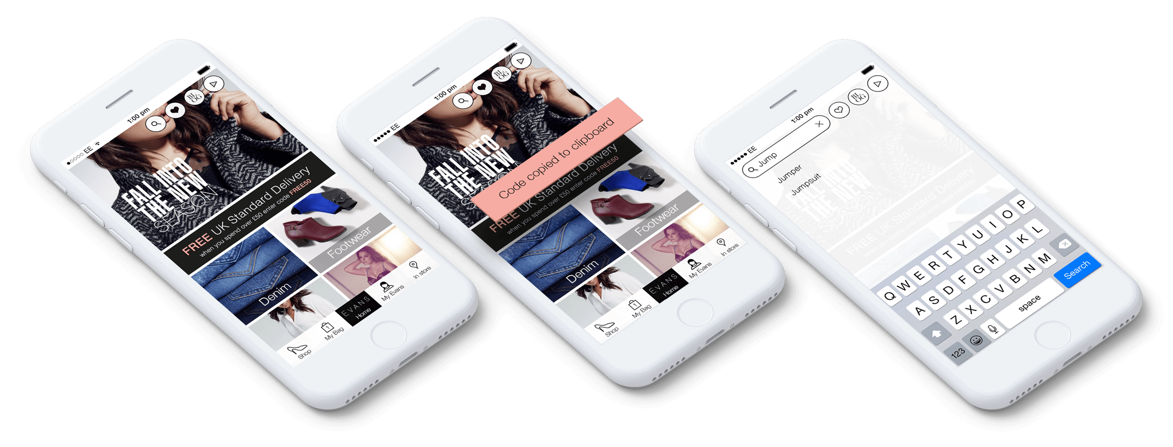
Taking inspiration from Evans’ site, I opted for a bright, ‘flat' interface, keeping a consistent brand experience across both platforms.
Using more intuitive icons taken from Evans' desktop site, I created a ‘sticky’ top navigation that allows for more content to be seen at once. The ‘wish list’ icon was integrated into the top navigation as I felt it is a great feature and should be immediately accessible at all times.
Buttons in the bottom navigation are arranged in consideration of priority and ease-of-reach.
Category labels are pulled into their product panels, reducing their height and allowing more content to be displayed at once. The ‘Free UK Standard Delivery’ promotional message moved to beneath the hero for greater prominence in the initial view.
Products shots were re-oriented so they look natural – lit from above.
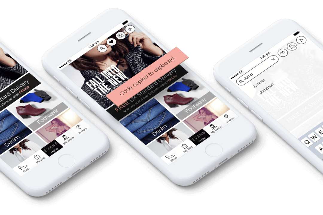
Light and airy
More content is now visible while prominently displaying a free delivery message, previously hidden further down the page.
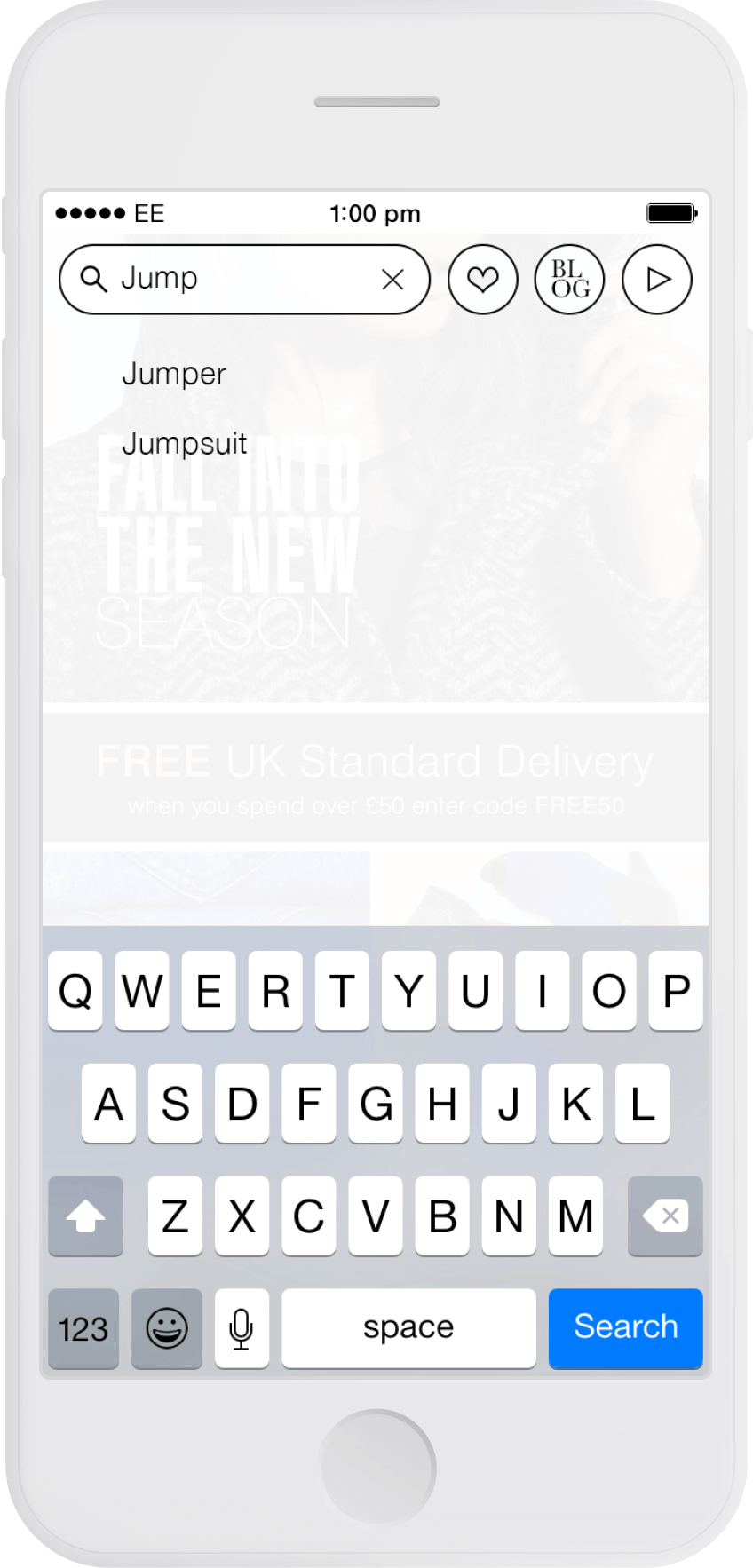
Suggested search terms
The search button expands to become a more helpful search field, helping visitors find their desired item of clothing.

Before / After
More of my work
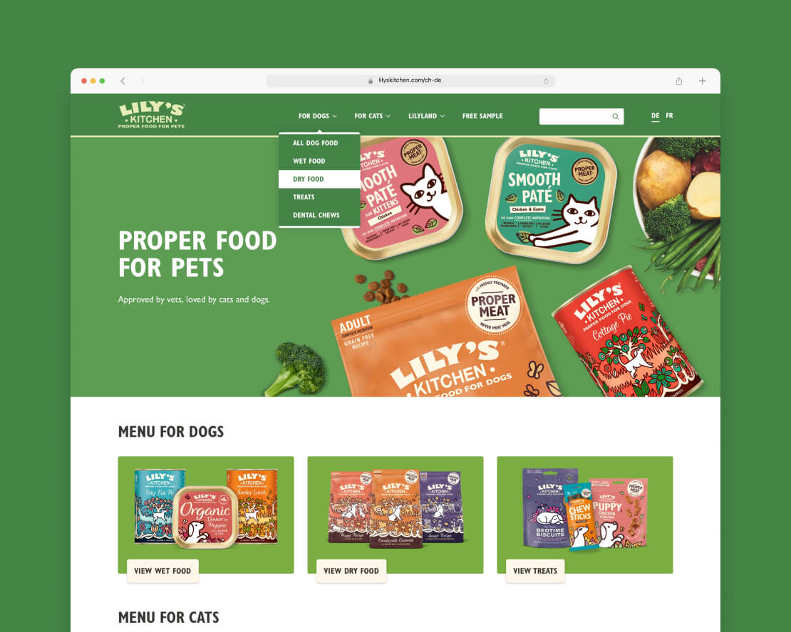
Lily’s Kitchen International TemplateUI & UX project for Lily’s Kitchen
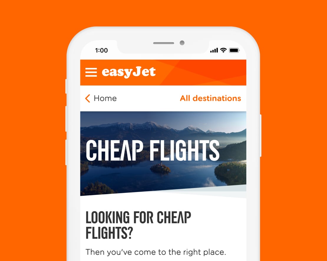
easyJet Cheap Flights web pagesUI & UX project at Valtech
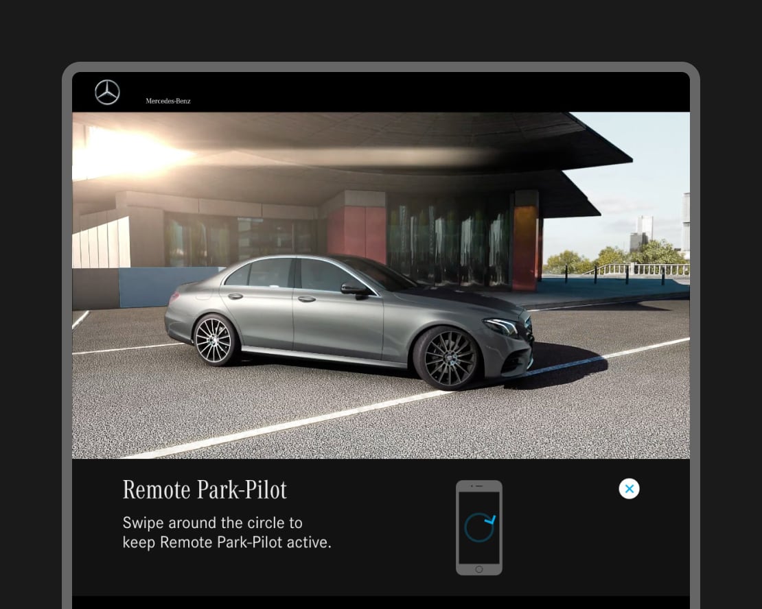
Mercedes-Benz interactive displayUI & UX project at Digital Annexe
The Mall’s RewardMe appUI project at Digital Annexe