easyjet cheap flights web pages
Elevating low-cost flights
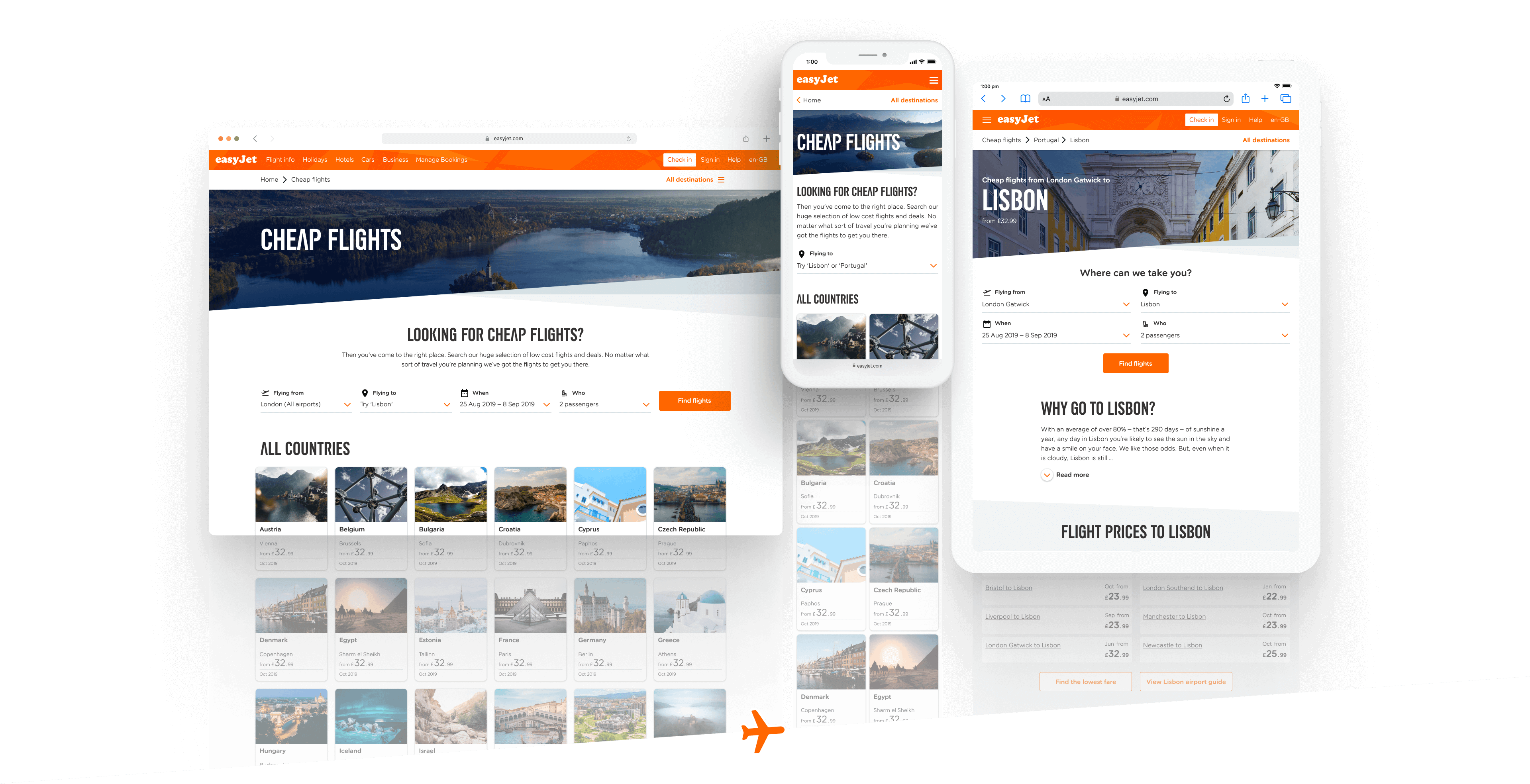
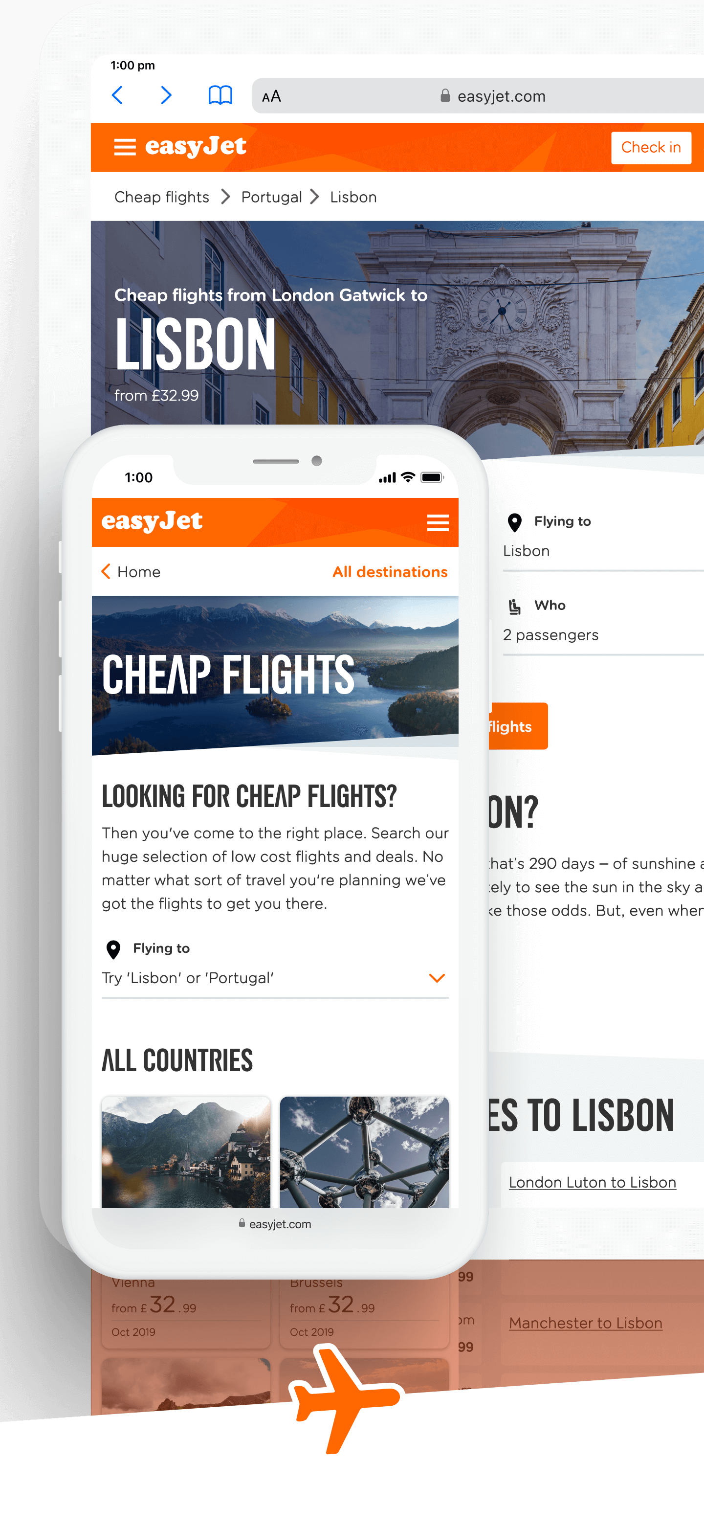
easyJet’s Cheap Flights section of their site provides a two-for-one destination that not only allows visitors to discover low-fare flights but explore a whole wealth of information about their chosen country and city too.
UI & UX project at Valtech
Brief
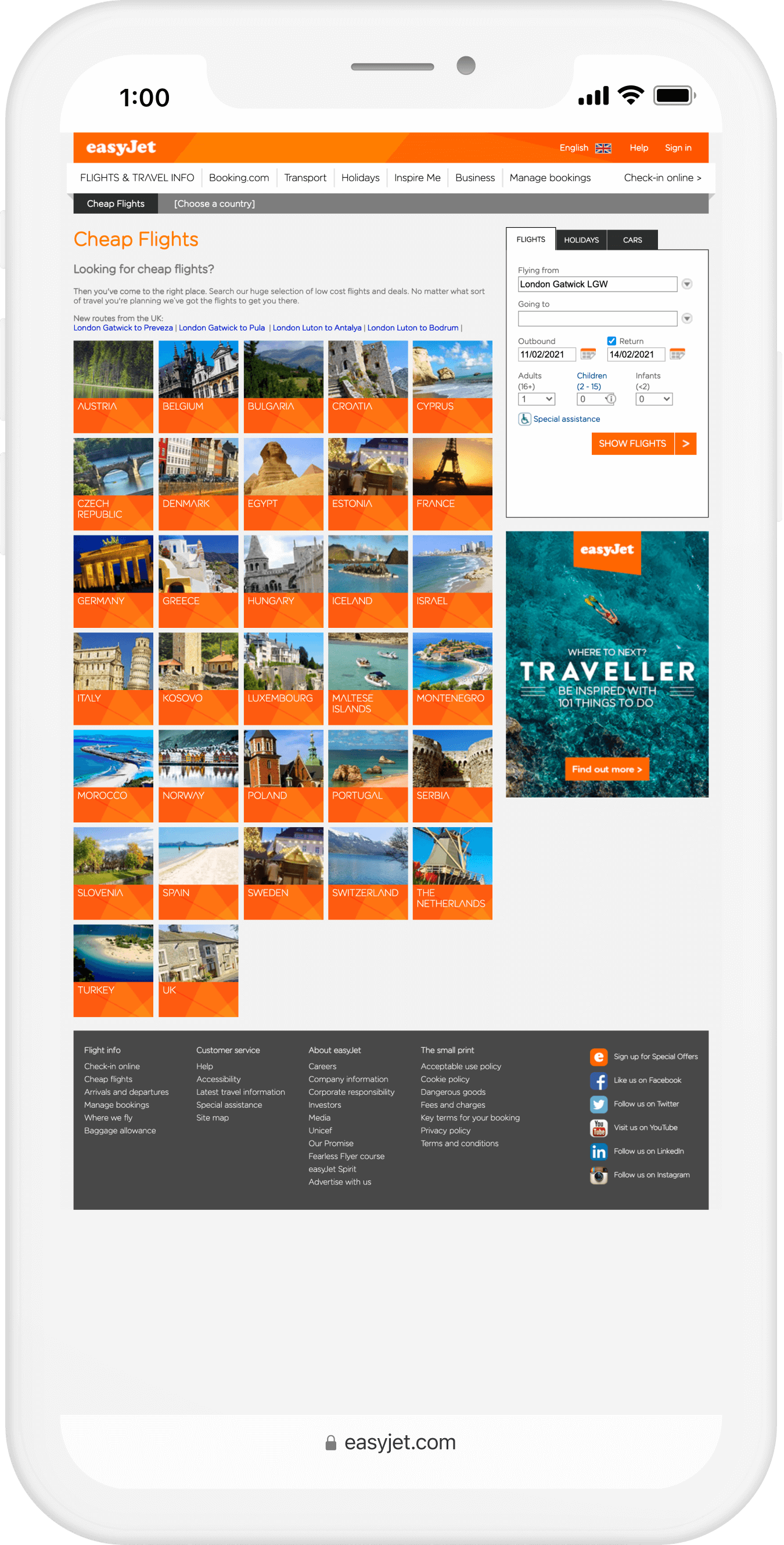
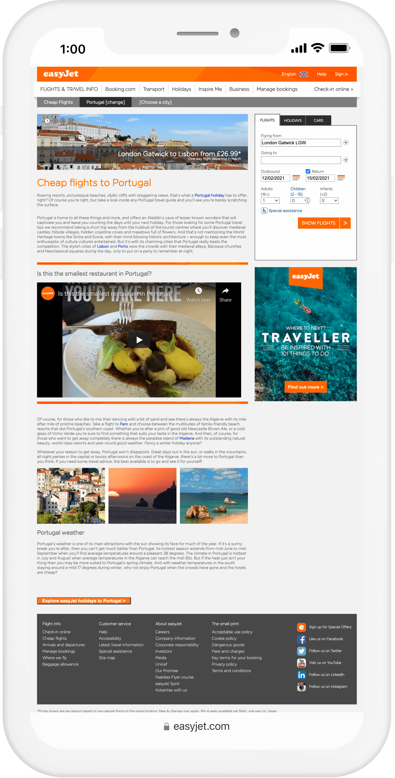
It had been several years, perhaps even a decade, since the Cheap Flights section of the site had been built. Its main purpose was to support Search Engine Optimisation (SEO), however, with all pages displaying on phones as a simply scaled-down version of the desktop view – rendering the experience virtually useless on small screens – traffic and conversion from these pages were down year-on-year.
Also, Google had notified easyJet that they had begun to crawl the site from a mobile-first perspective. Therefore, it was vital to redesign and rebuild the entire section of the website in order to restore their search engine rank, and increase traffic levels and conversion rates.
My role
Competitor research, wireframing, prototyping, visual design, UI component library, usability testing.
Team
Alex Black, Alex Meah, Dave Aldridge, Jacinda Alderson, Jen Slater, John Parker, Laura Thurgood, Lydia Livingston, Philip Bushnell.
Analysis
The existing pages’ styles and layouts were dated and unsuitable for purpose on smaller screens as they were not responsive.
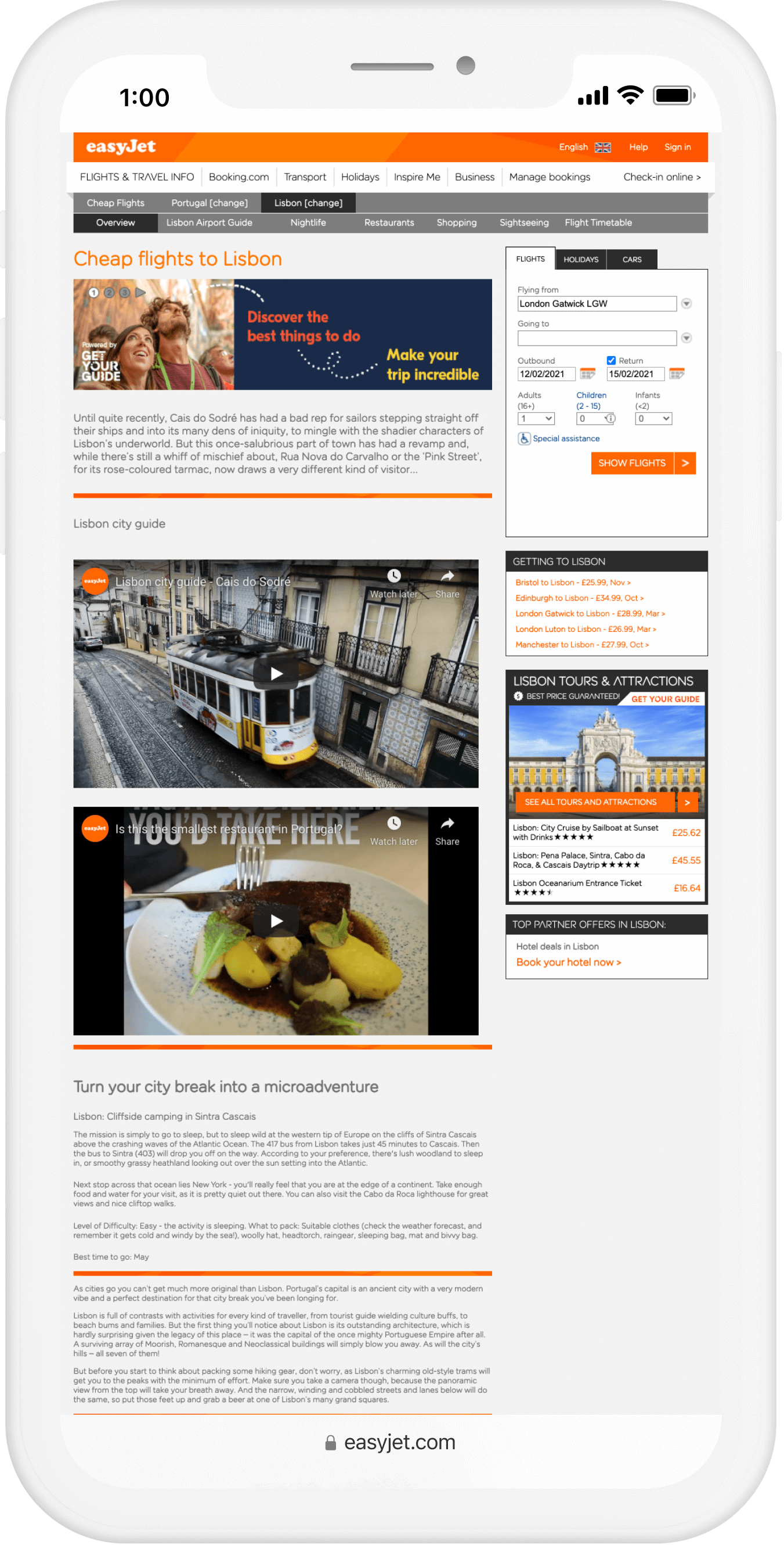
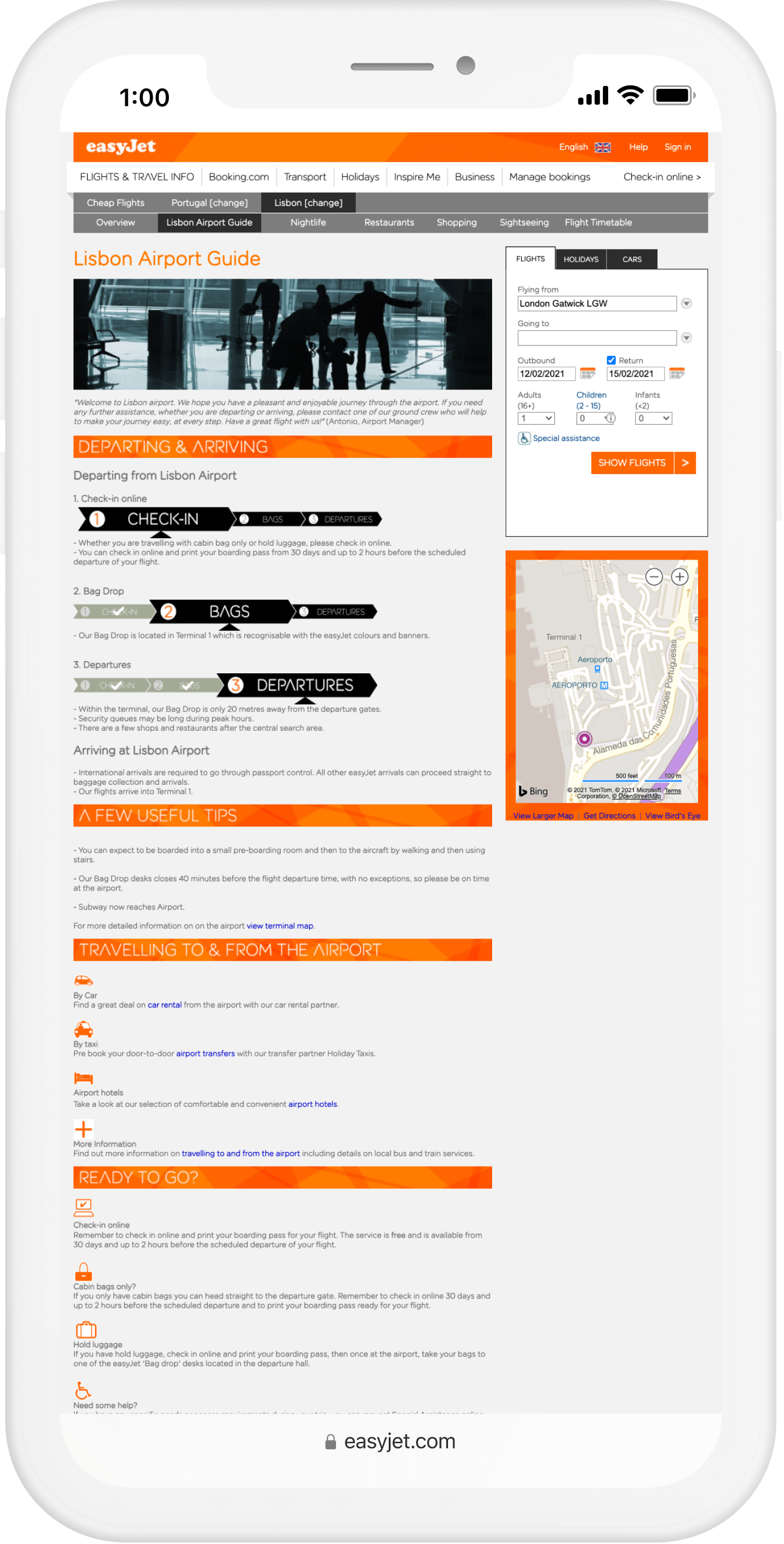
Competitor research
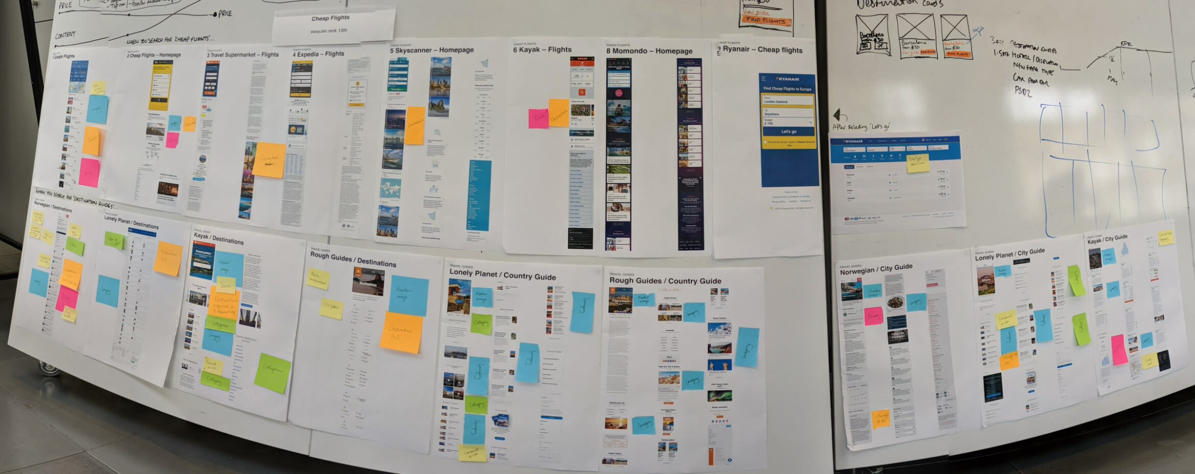
The competition were ahead in numerous ways – their equivalent pages were easy-to-use and looked great on small devices.
Search engine ranking
As easyJet ranked 13th in Google’s search results for ‘Cheap Flights’, I compared all sites ranking above it, from comparison sites like Google Flights to airlines such as Ryanair.
Prioritising the right information at the right time
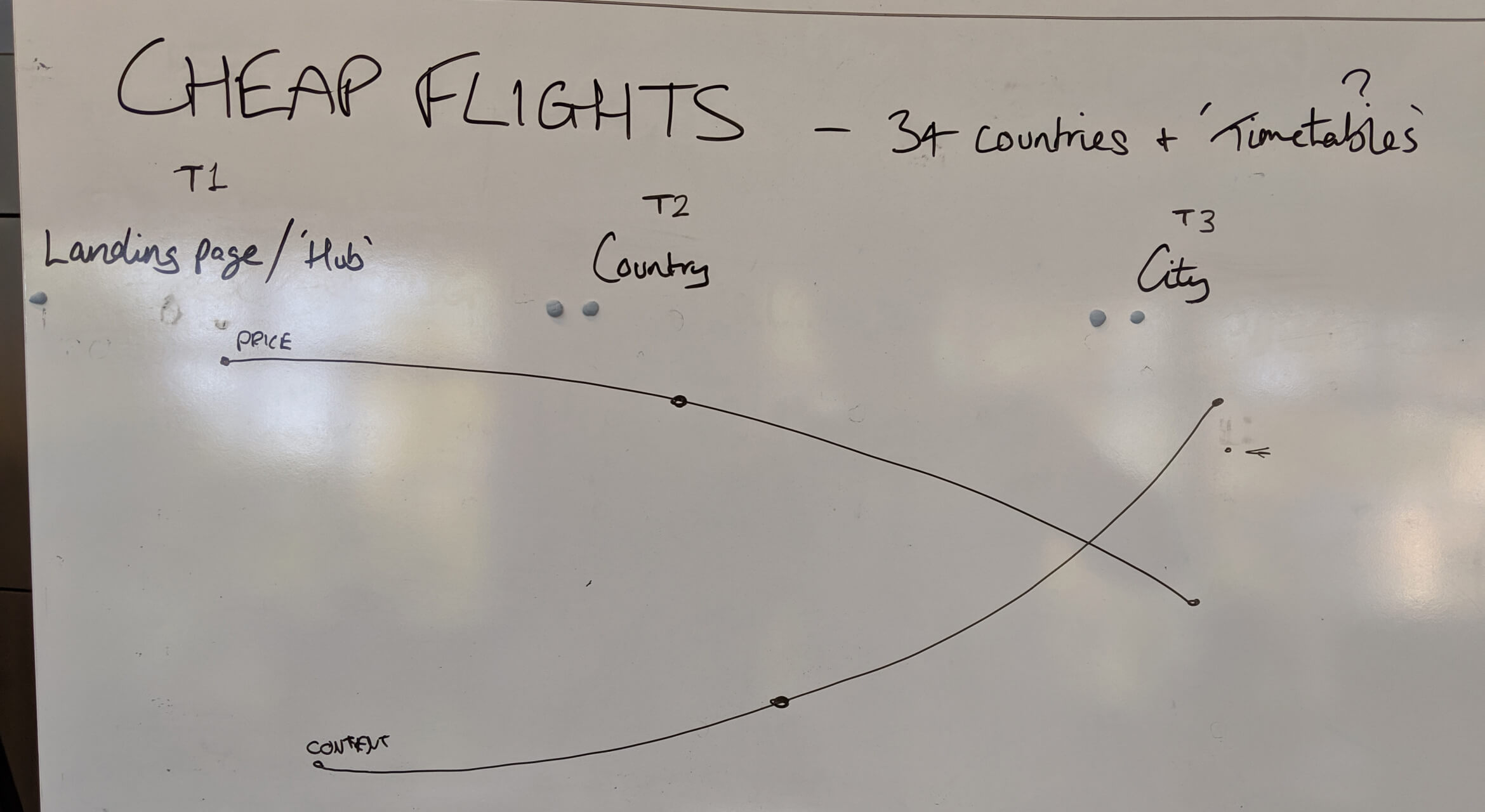
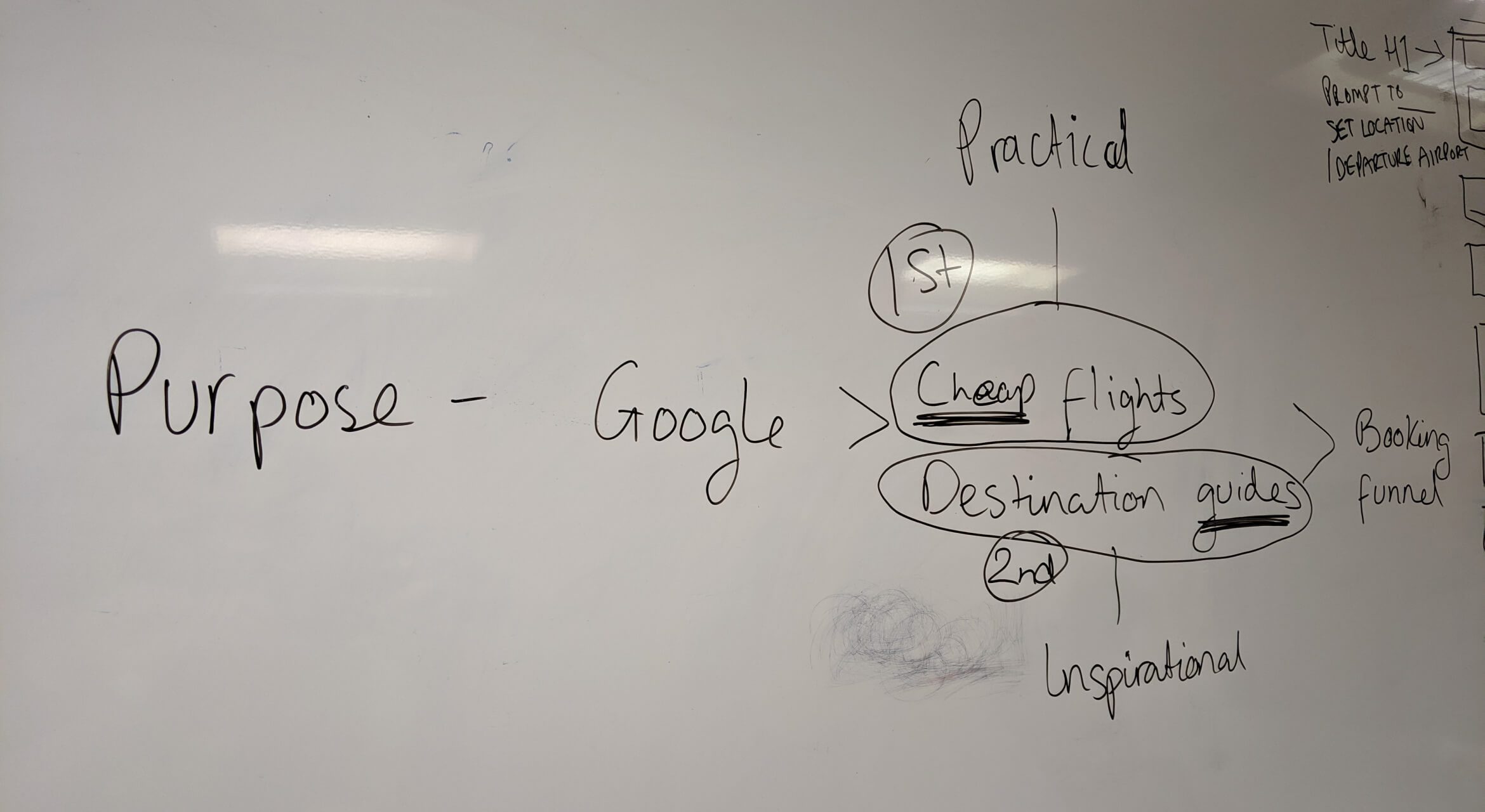
It was important to balance the business’s SEO needs with visitors’ expectations of this section and surface the right information at each point in the journey. Although the project was internally known as ‘Destination Guides’, the website section’s name and the first priority was to surface prices of ‘Cheap Flights’, and destination guides second.
Wireframes
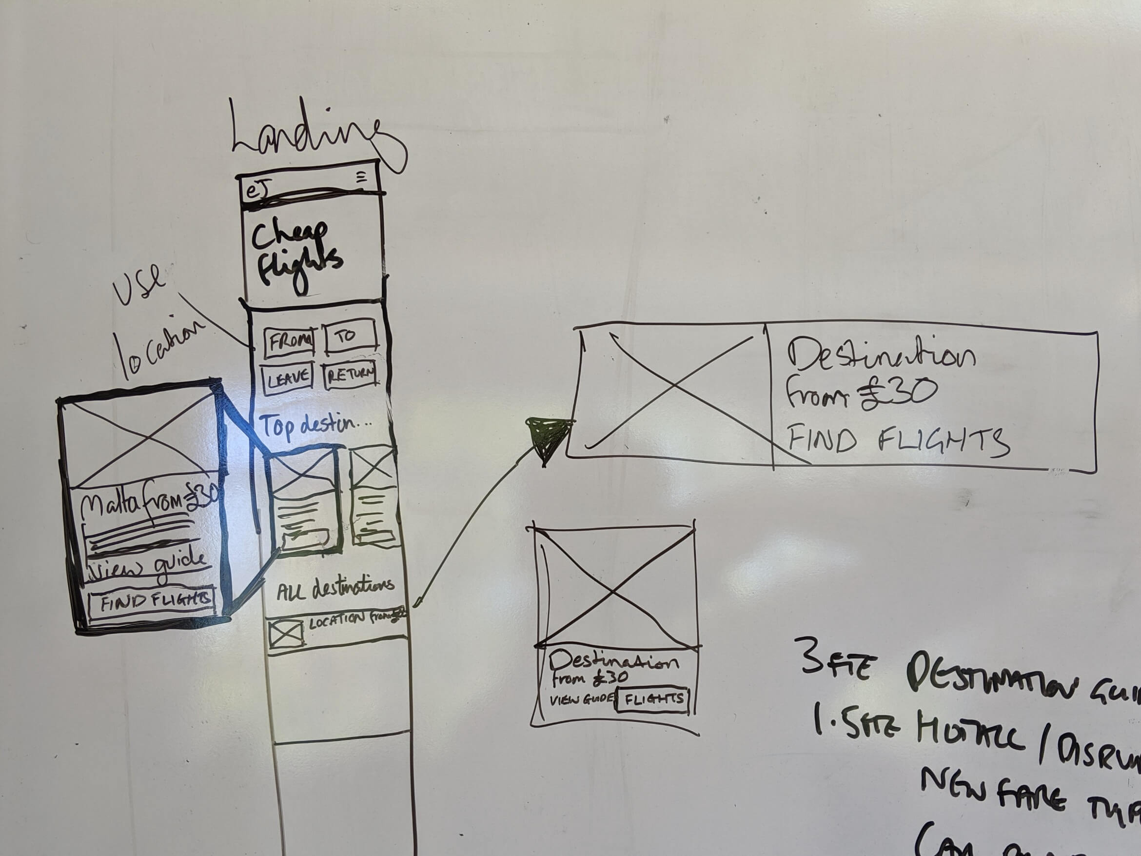
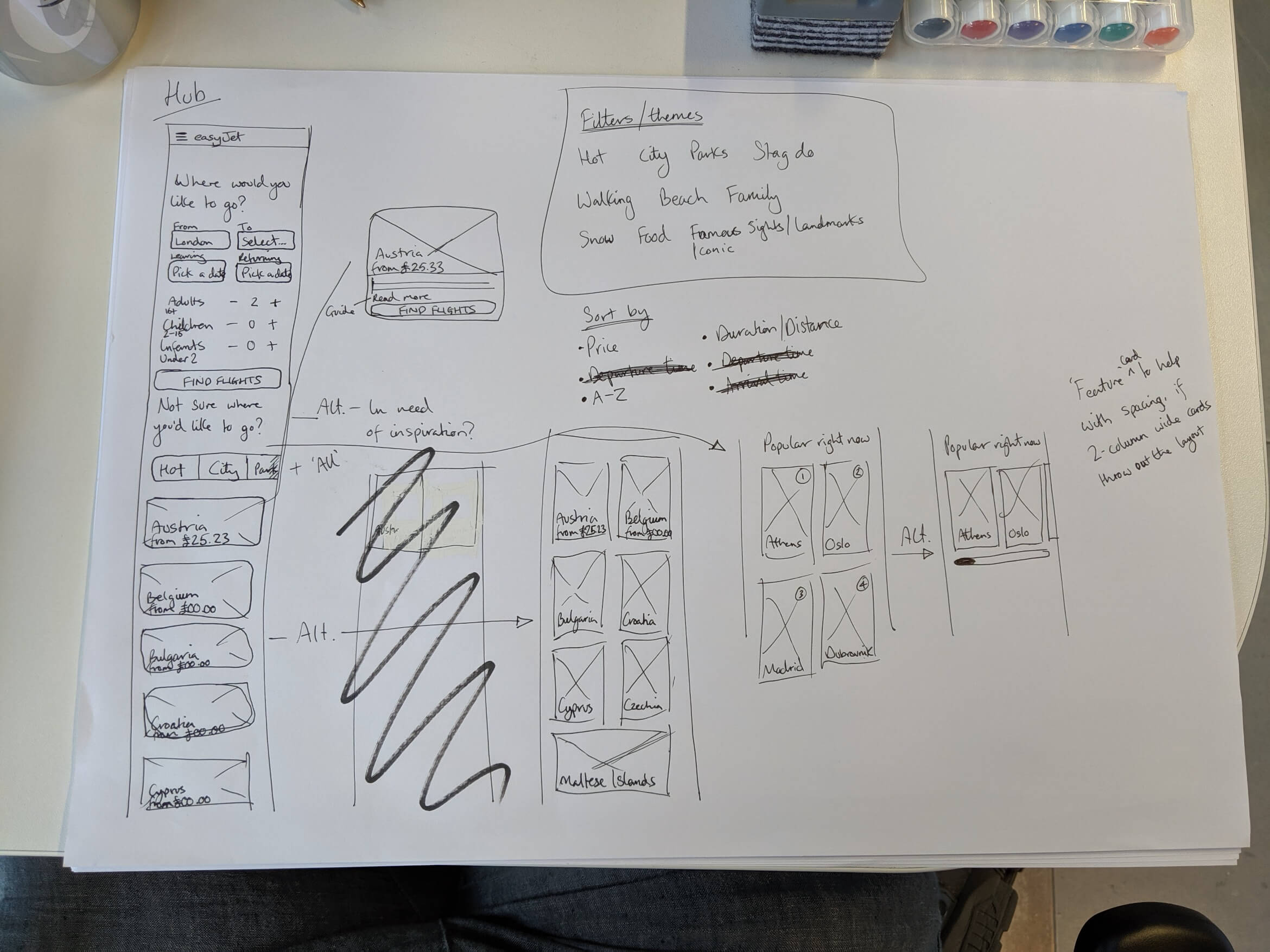
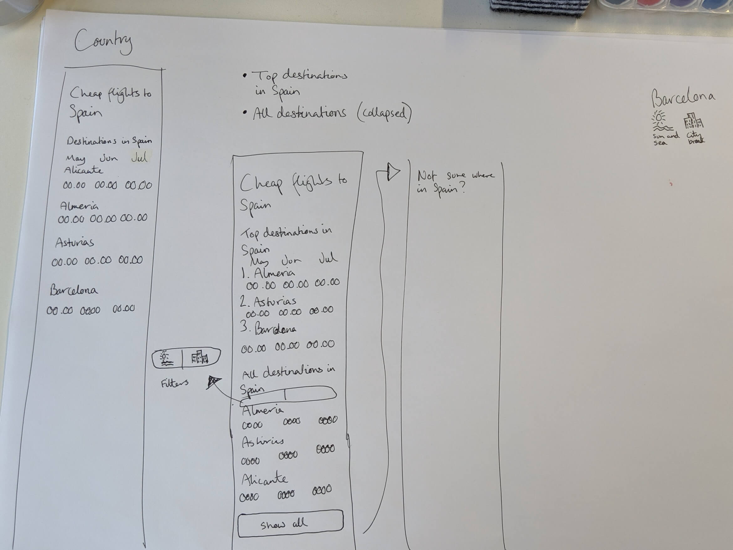
Having analysed the existing pages and researched the information competitors were providing, I was ready to begin the process of sketching out some wireframe ideas.
Writing first
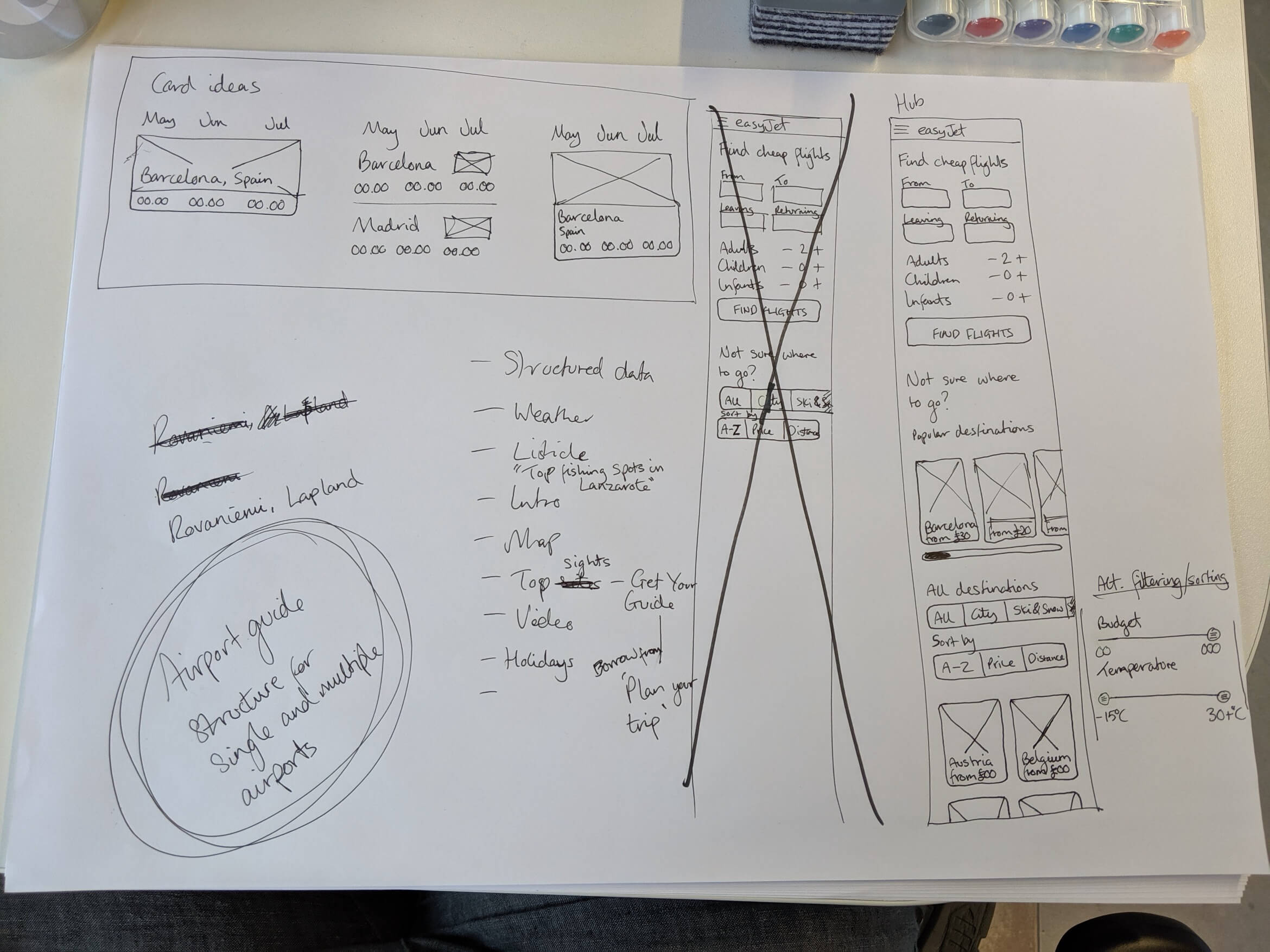
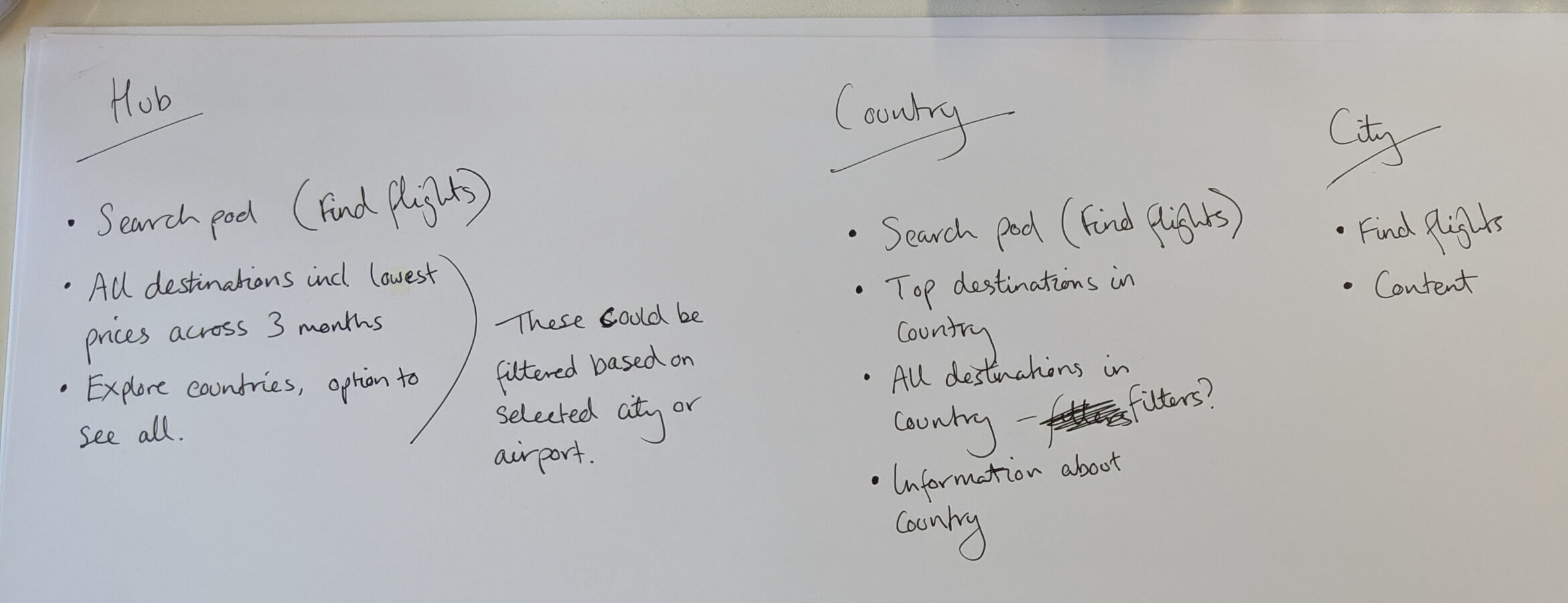
Before sketching out the initial wireframes, I tend to make a list of the types of content needed to give myself criteria to check against. This helps me build the picture in my head before building it in digital form.
Early sketches
Sketching ideas on paper or a whiteboard allow for quick visualisation of layout ideas, helping me get an idea of how a page could look and convey that idea to others. It also saves me thinking about detail that is unnecessary at this stage.
easyJet’s grid
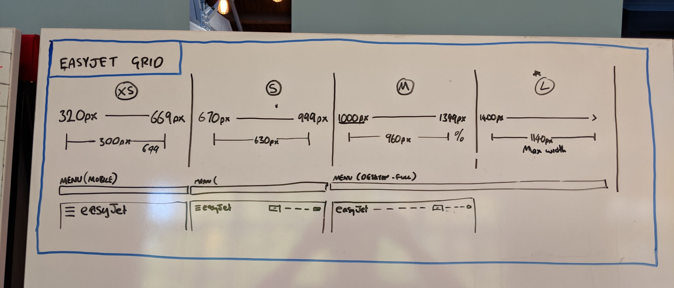
As my colleague, Malcolm Seaborn, was working on sister project ‘View Booking’, we made sure to align with each other, using the same grid and breakpoints to ensure consistency across the two experiences.
Design
Based on my research and discussions with easyJet, I created an initial layout of the Cheap Flights landing page a.k.a. the ‘Hub’.
The evolution of the Hub
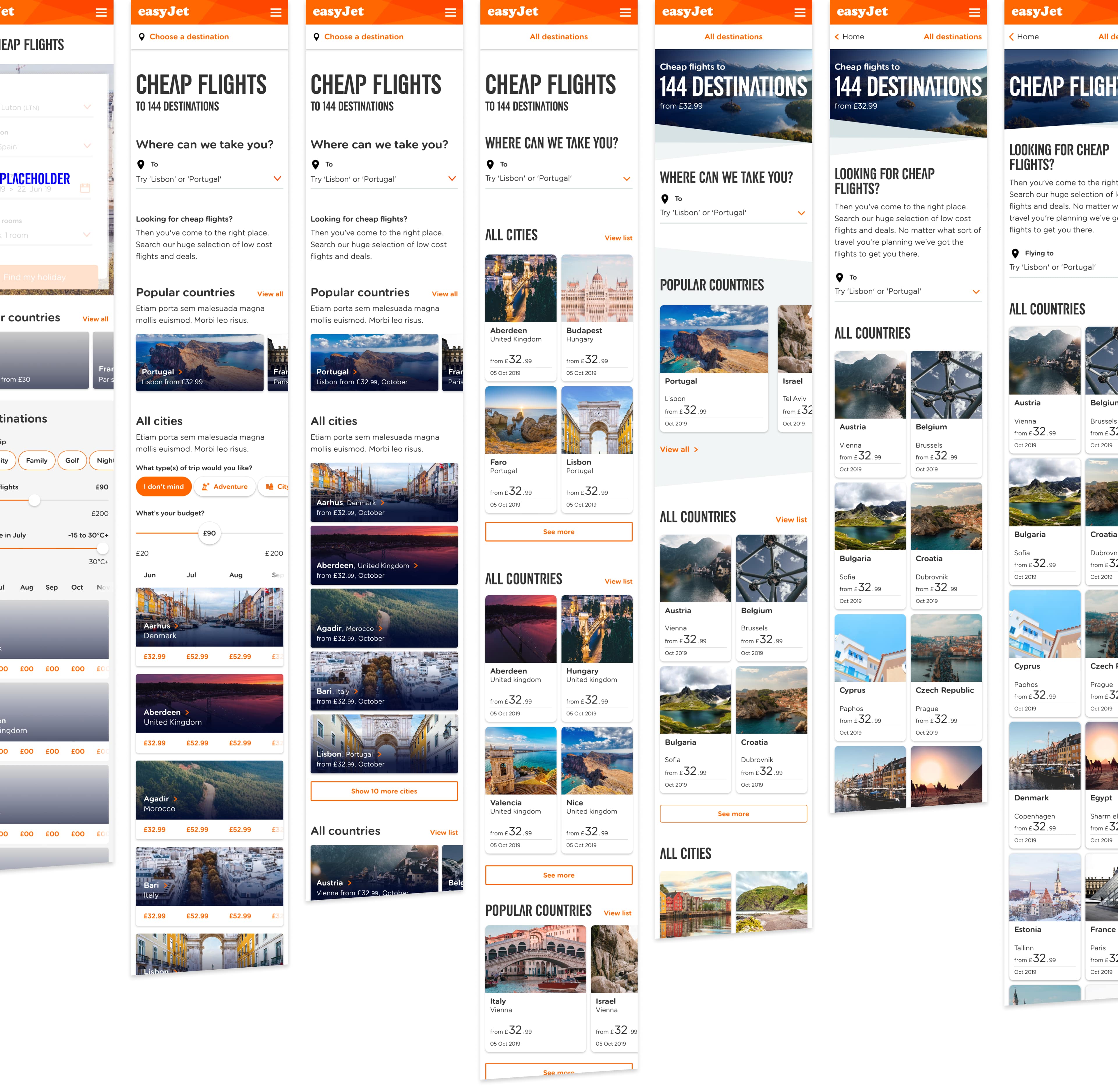
To provide a useful way of exploring destinations, not only by price but trip type and climate too, I suggested filters to narrow down the results to desired destinations.
However, following an iteration or two, easyJet decided this feature would be better suited to their ‘Inspire Me’ tool.
The simplification of the Hub
After some exploration of new features and layouts, the landing page was simplified, to what essentially became a re-skin of their existing landing page, to avoid changing easyJet’s SEO structure.
Design system
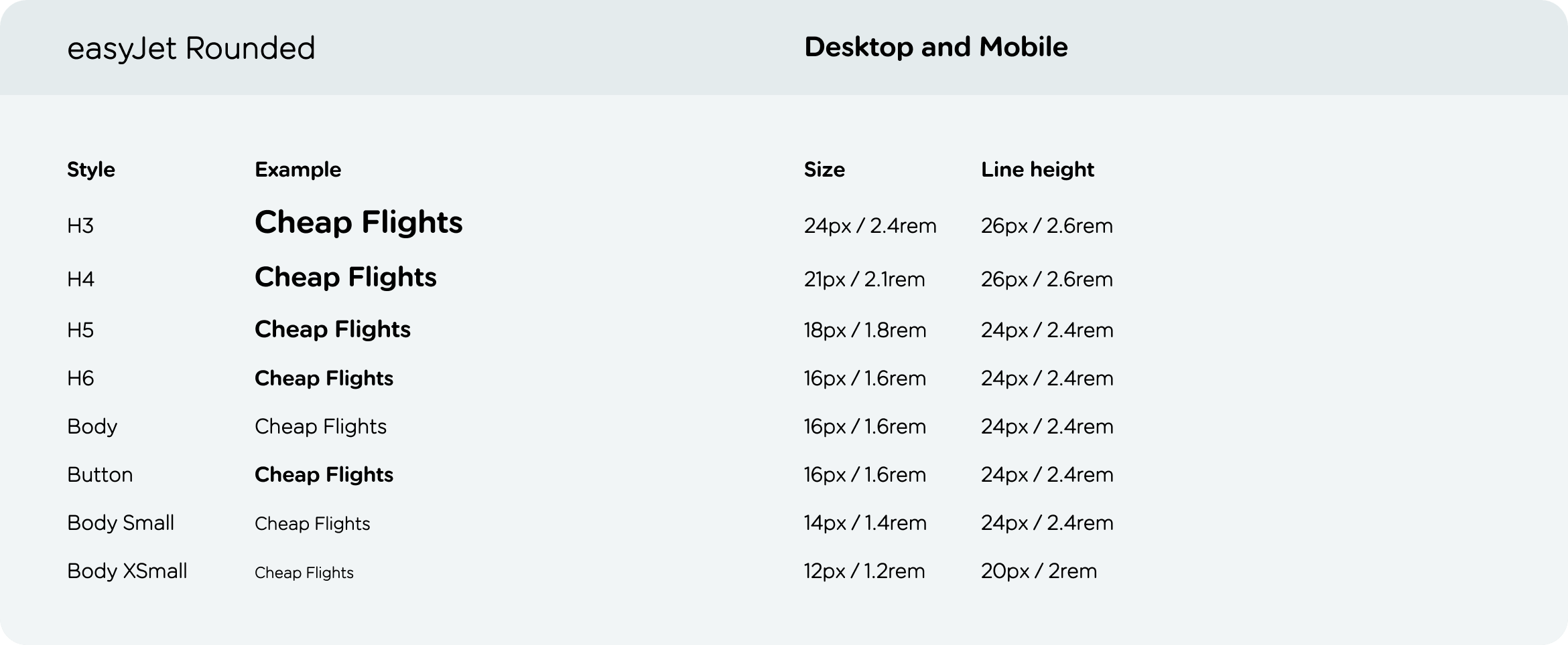
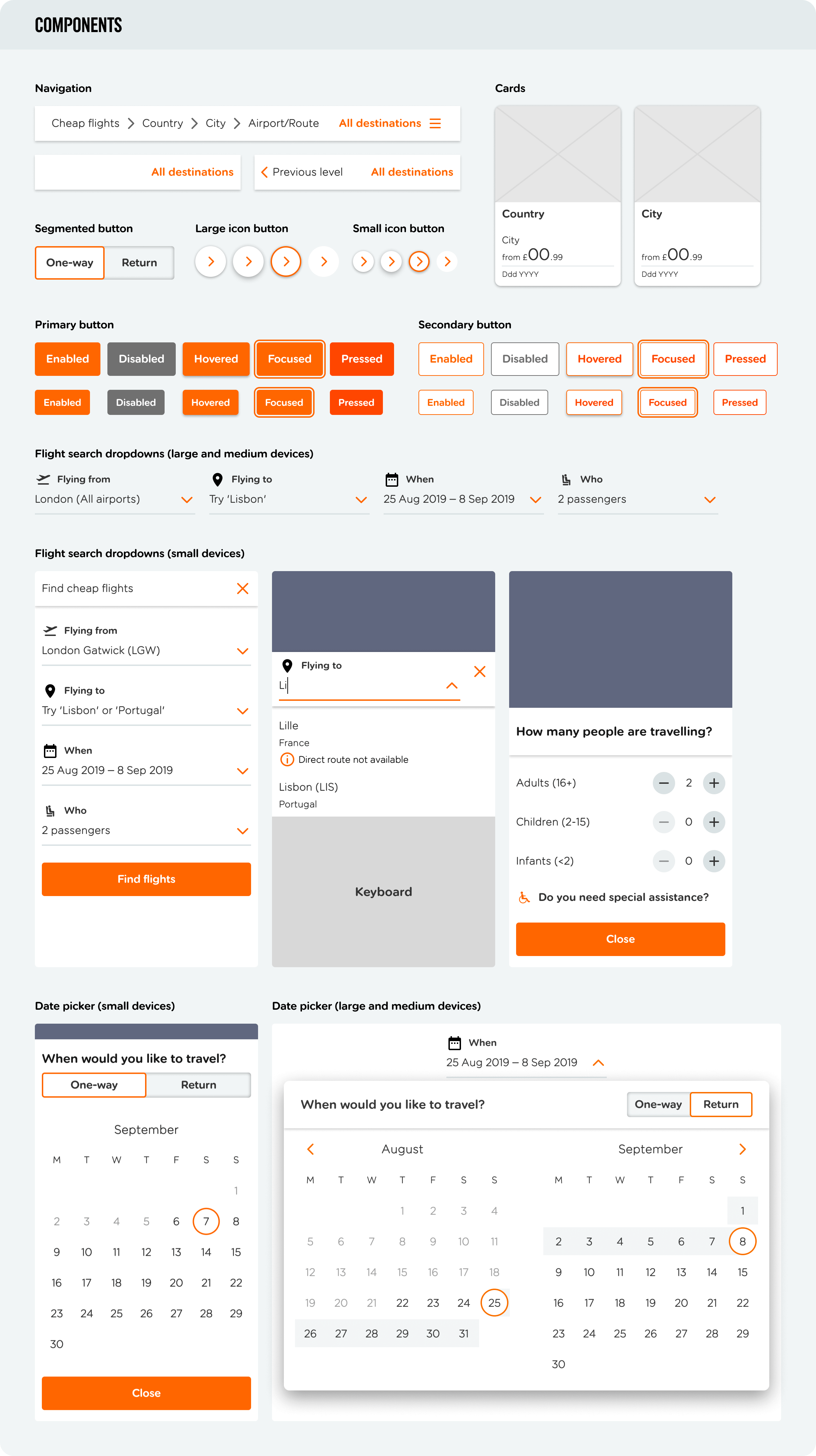
Malcolm Seaborn and I worked together to begin creating a library of components within Sketch shared across both of our easyJet projects. We then collaborated with the team’s front-end developers to translate the Sketch library into a design system within Storybook.
In easyJet’s code, their type system has a base size of 10px meaning the rem equivalent is the type size in pixels divided by 10.


Prototyping
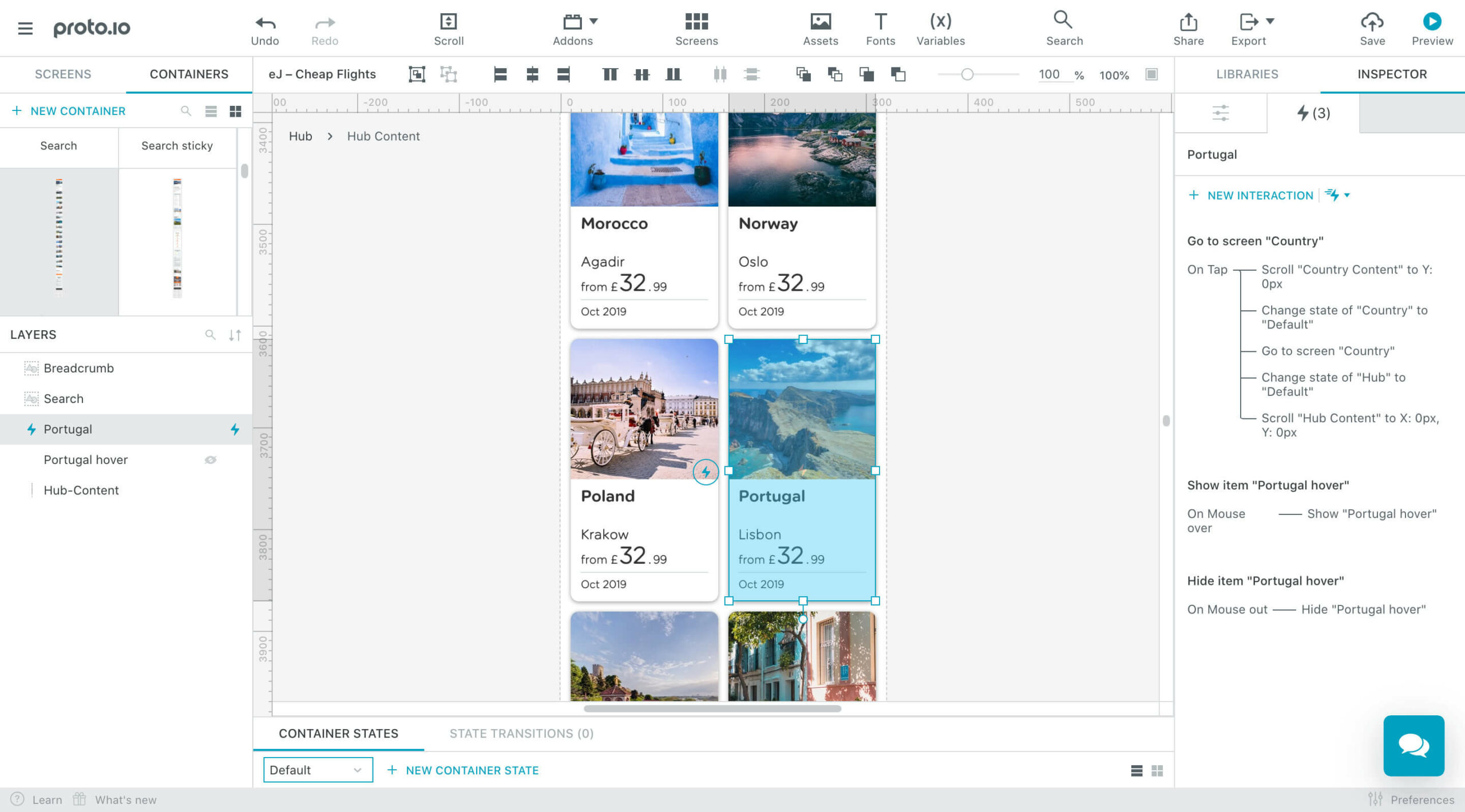
In order to explore how the new Cheap Flights would behave and how it would be received by usability test candidates, I created a prototype in Proto.io. This allowed a person to move through from the landing page to a single page at each level of the journey: Country, City, Airport Guide and Route.
Using Proto.io
Creating the prototype in Proto.io allowed me to build a richer prototype than was possible in Sketch or InVision. I was able to animate hover states for cards, and allow the navigation and search elements of the interface to stick to the top at separate points.
Feel free to try out the prototype for yourself 🙂
Tip: You can visit the pages for Portugal and Lisbon, and reach Lisbon’s Airport Guide from the Lisbon page.

Testing
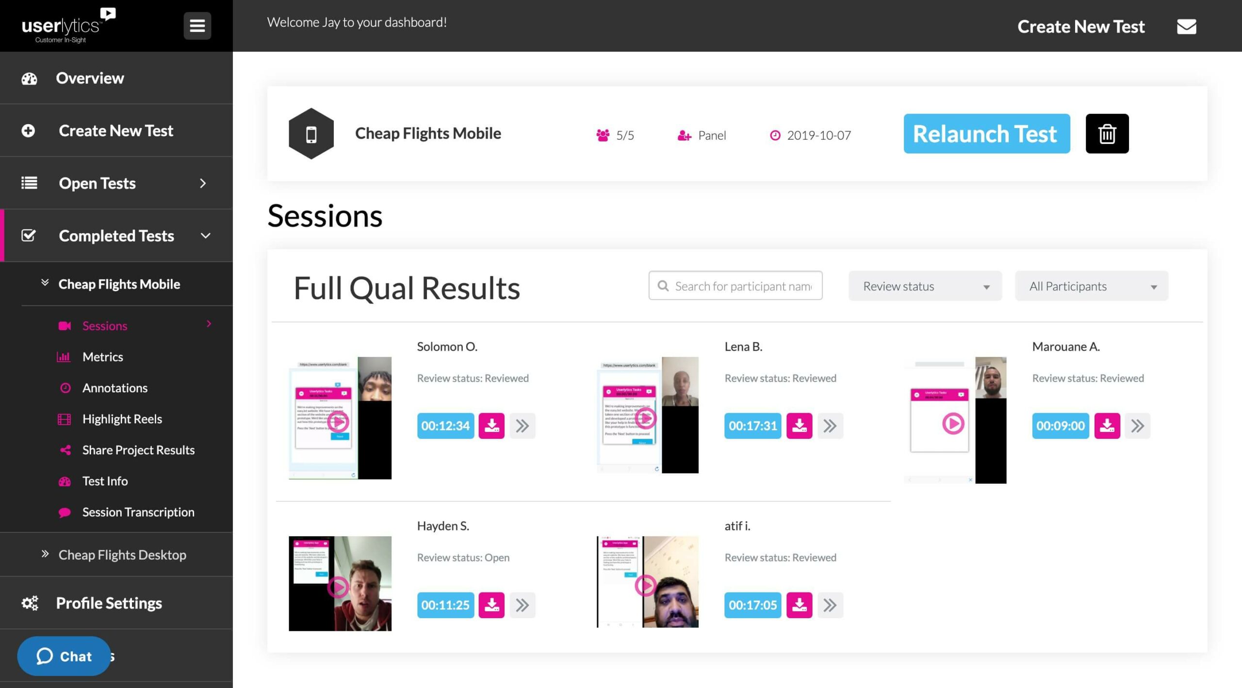
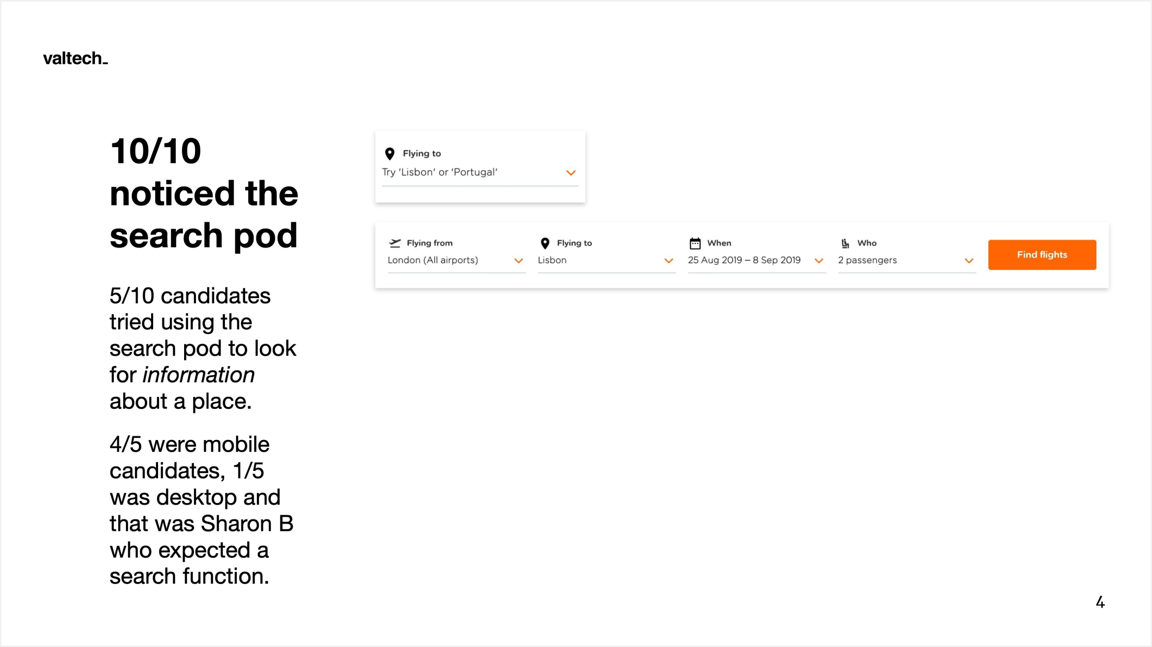
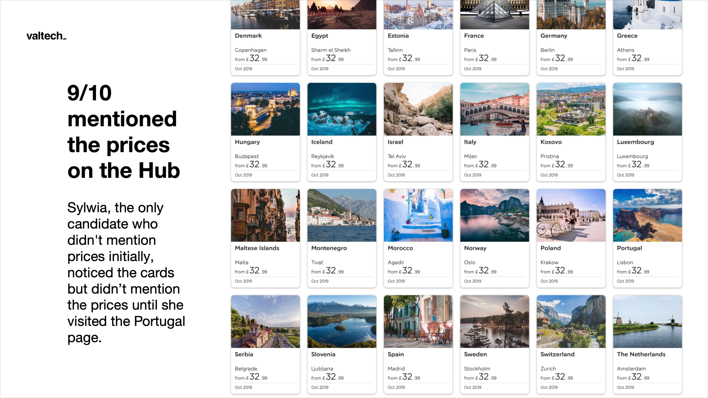
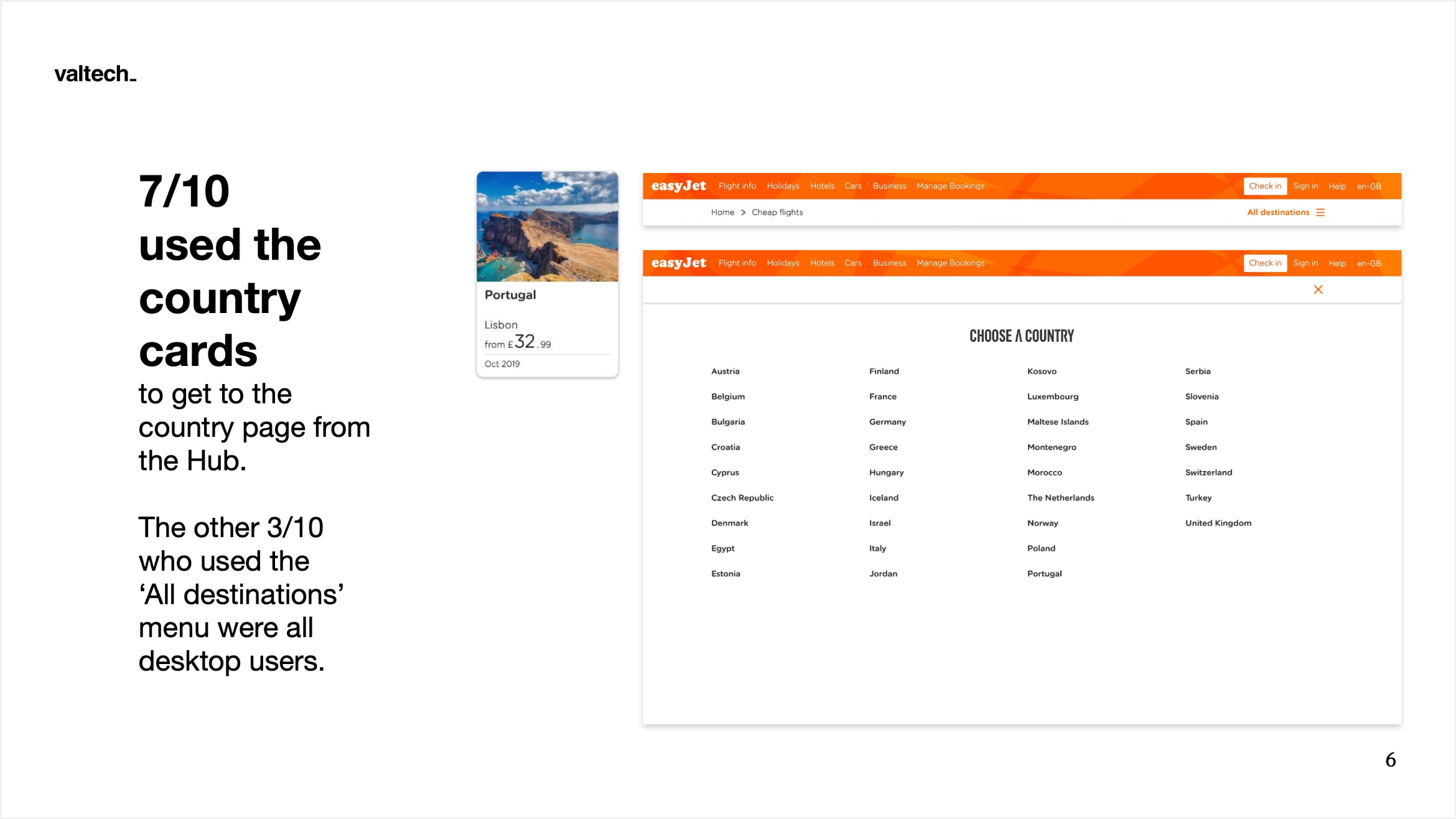
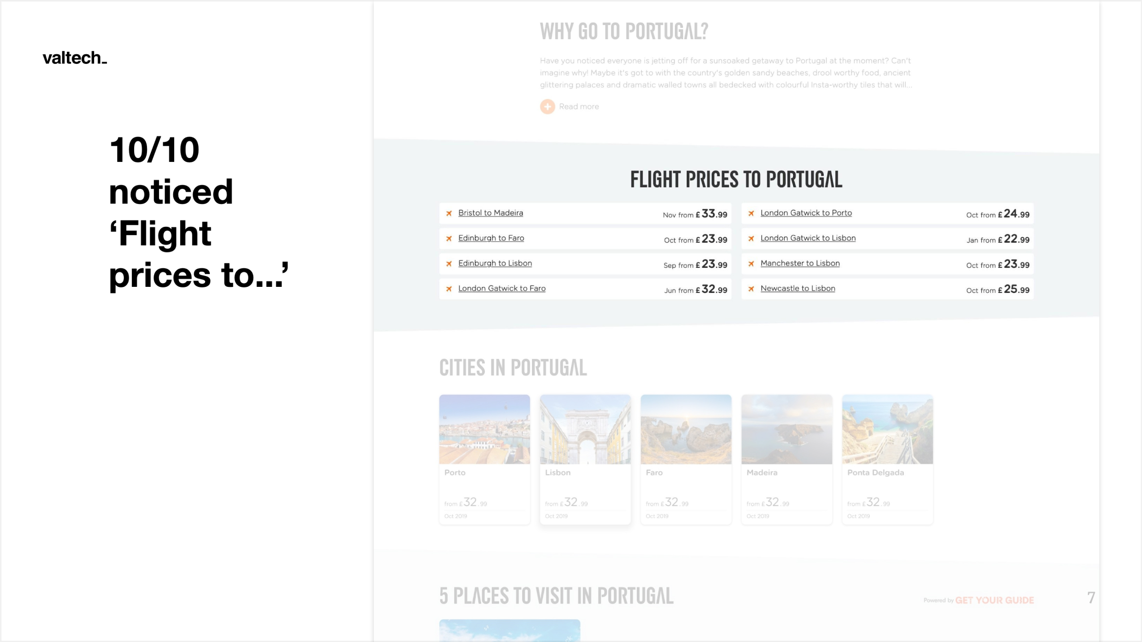
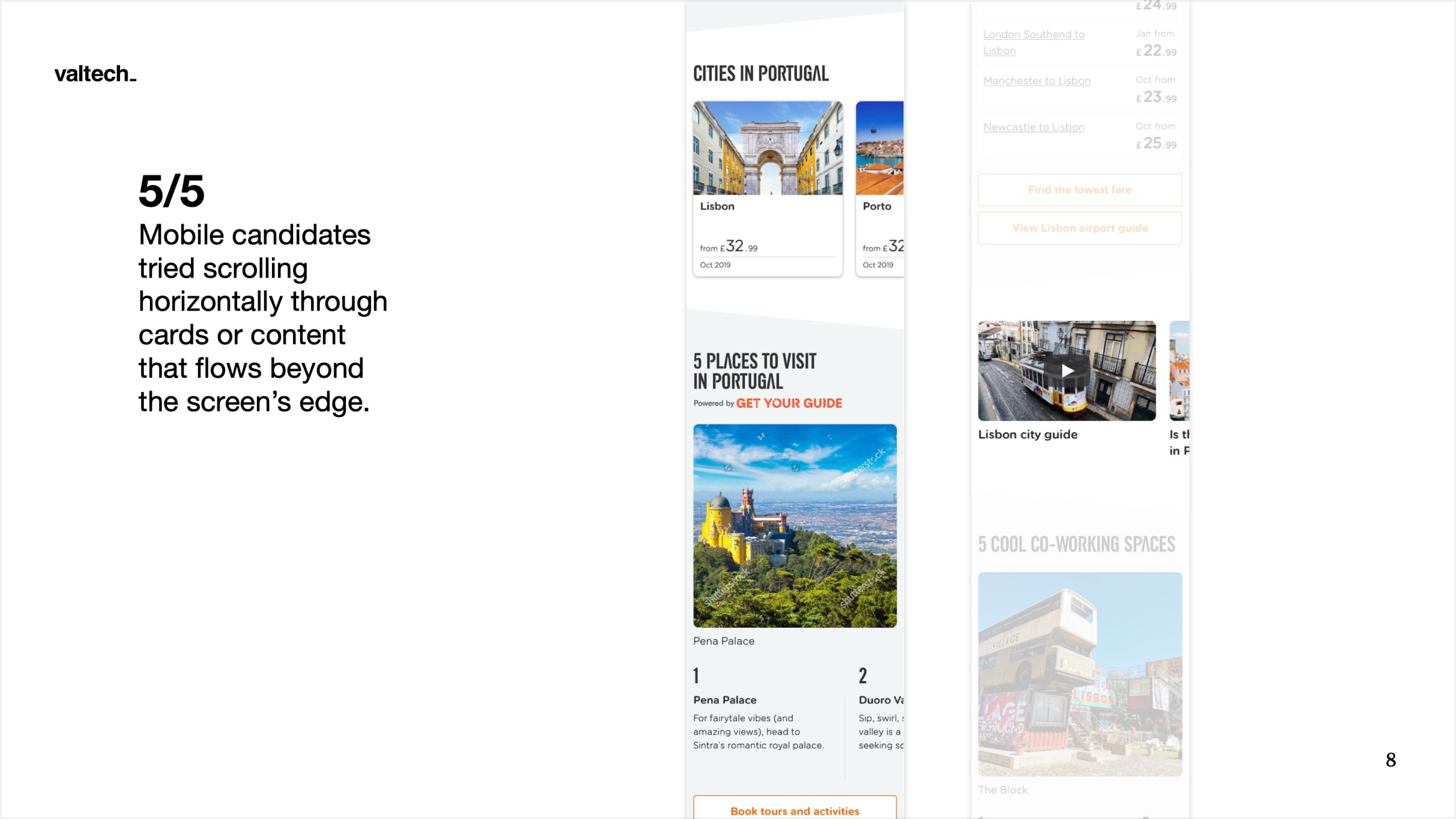
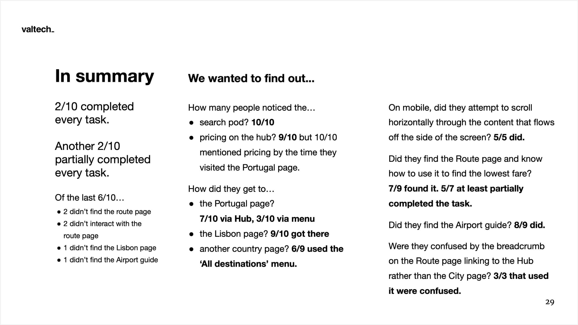
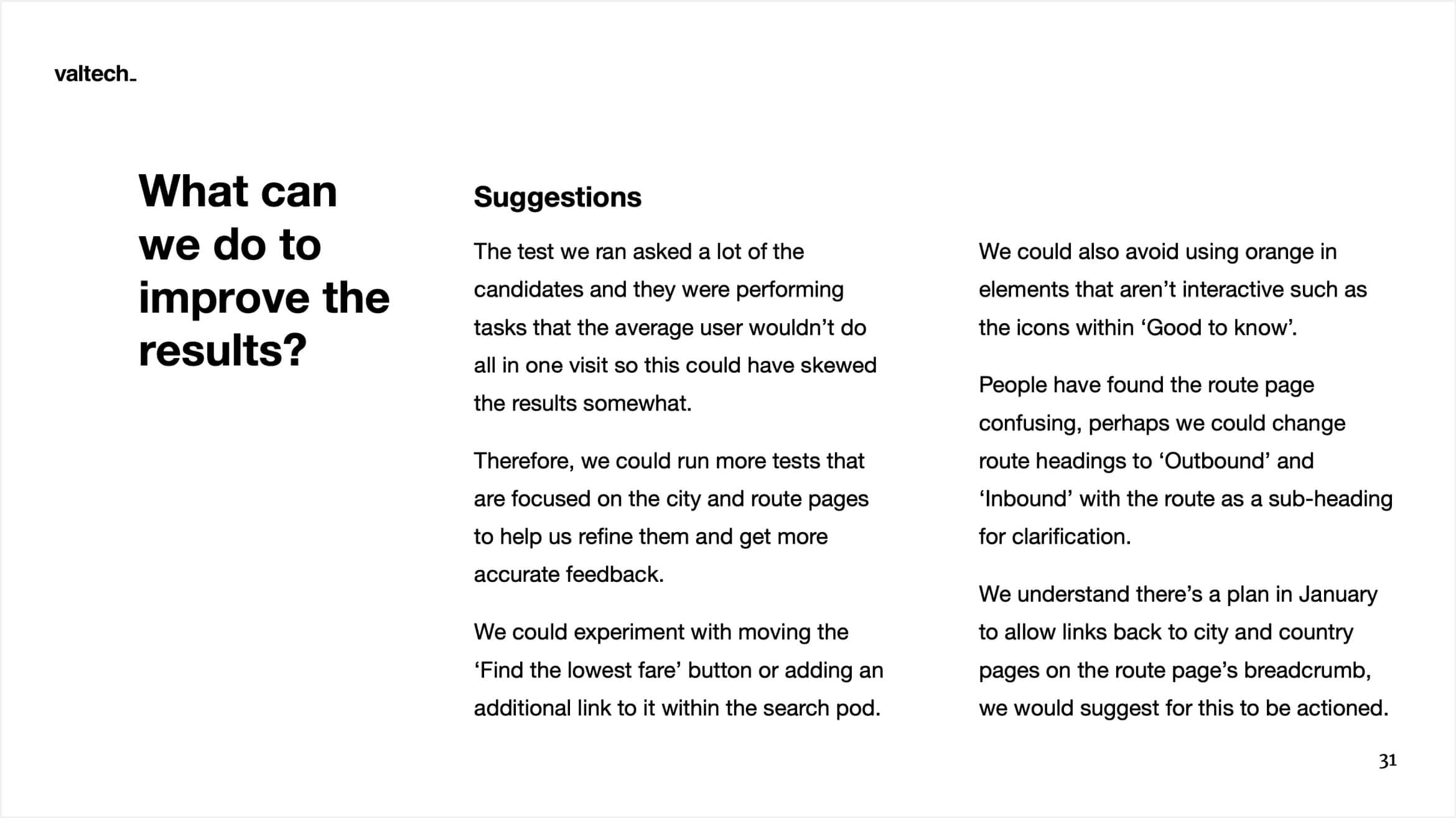
Unmoderated remote usability testing was conducted using Userlytics. I wrote and set up two separate tests for both the mobile and desktop prototypes that I'd created using Proto.io and ran them with 5 participants each.
Result
These are the last visuals I created before the Cheap Flights build was paused. The project didn’t progress again until after I left Valtech, but a stripped-back version has since gone live on easyJet’s site.
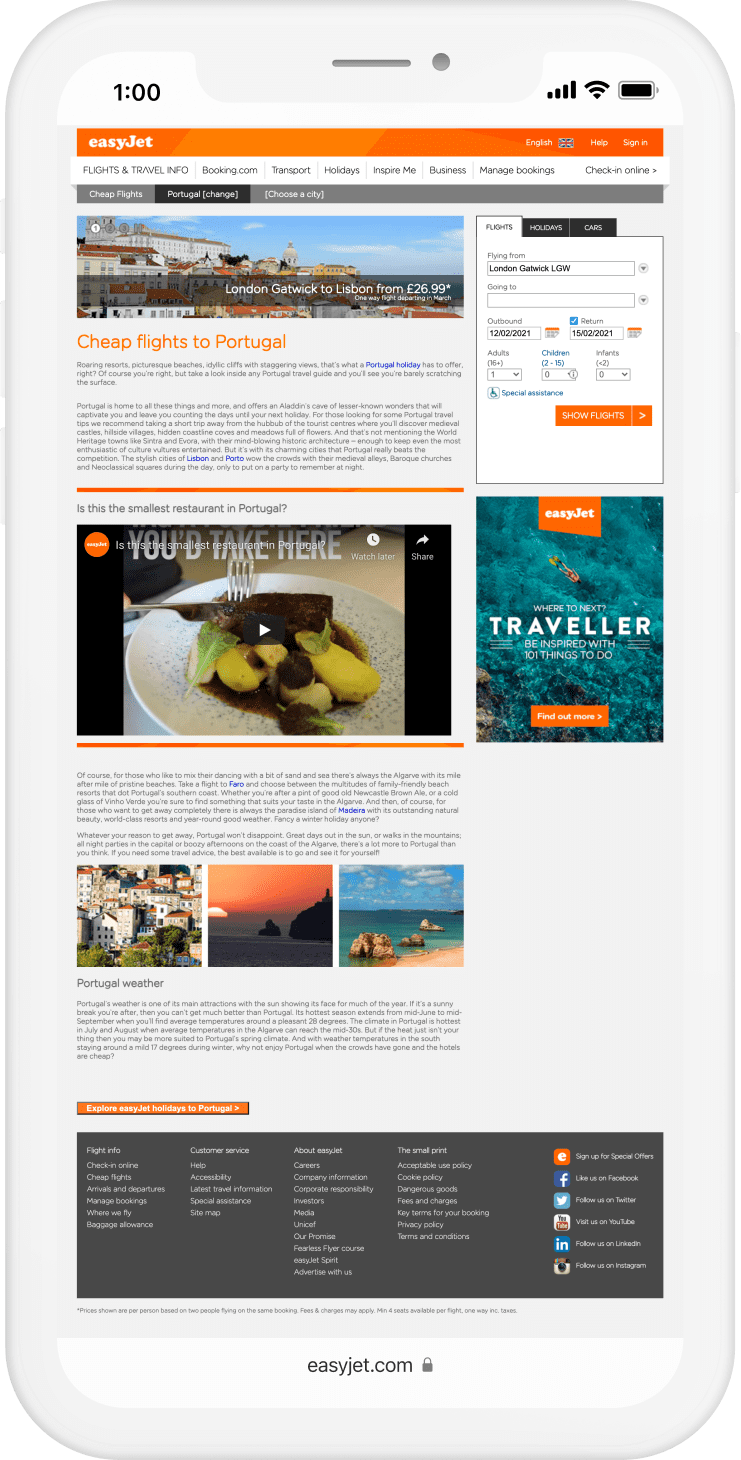
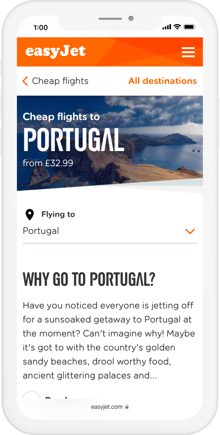
Small layouts – Before and after
Scrub back and forth on each image to compare the old and new versions of each page.
Hub
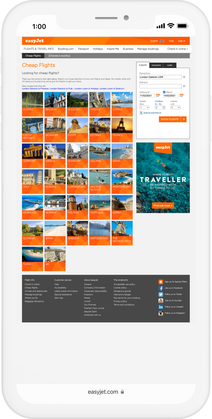
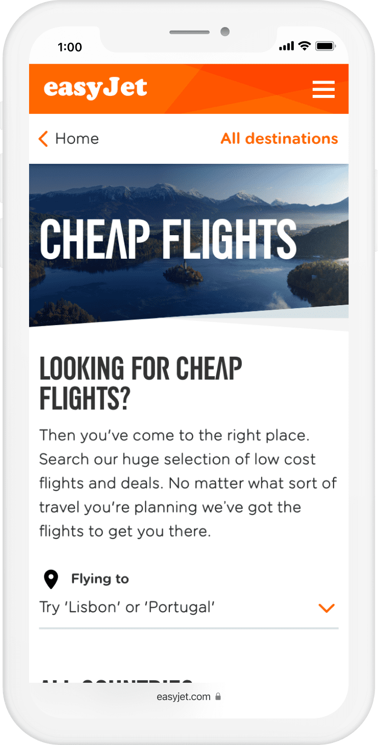
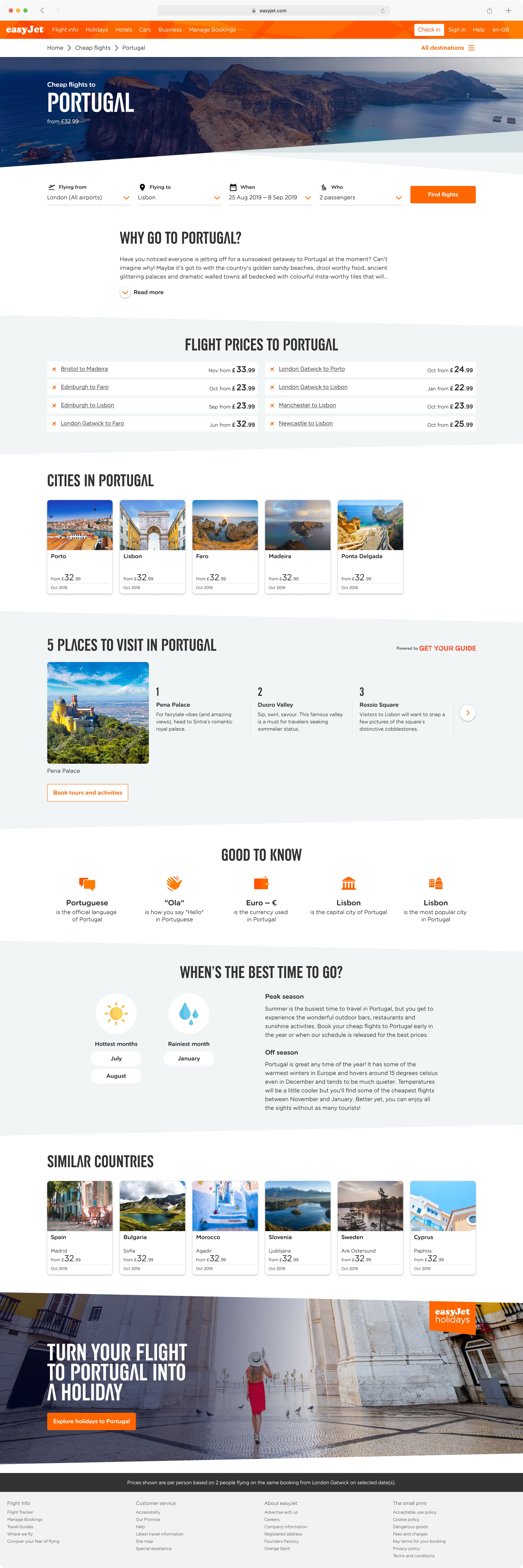
Country
City


Large Hub layout – Before and after comparison

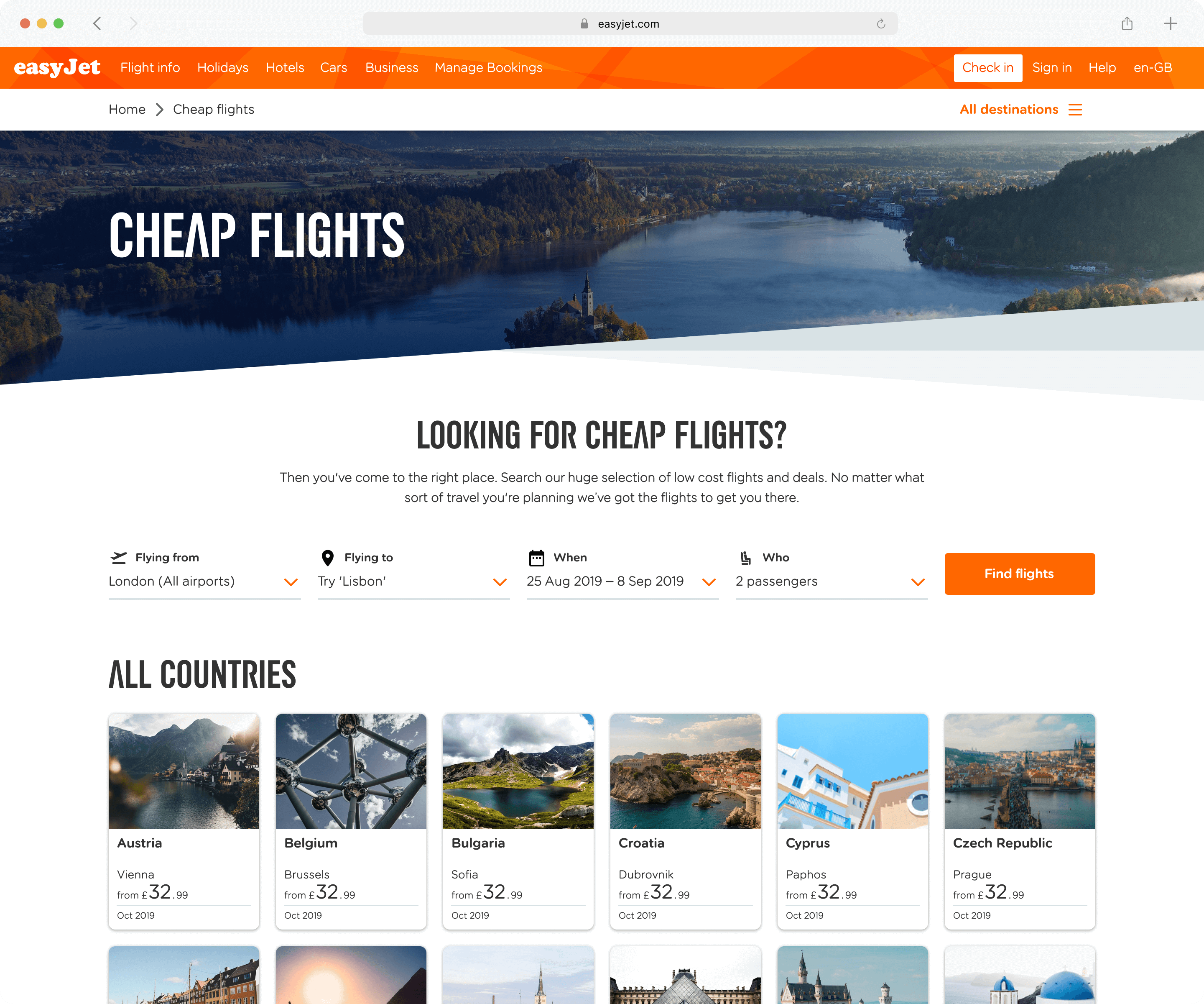
Small layouts – Full pages
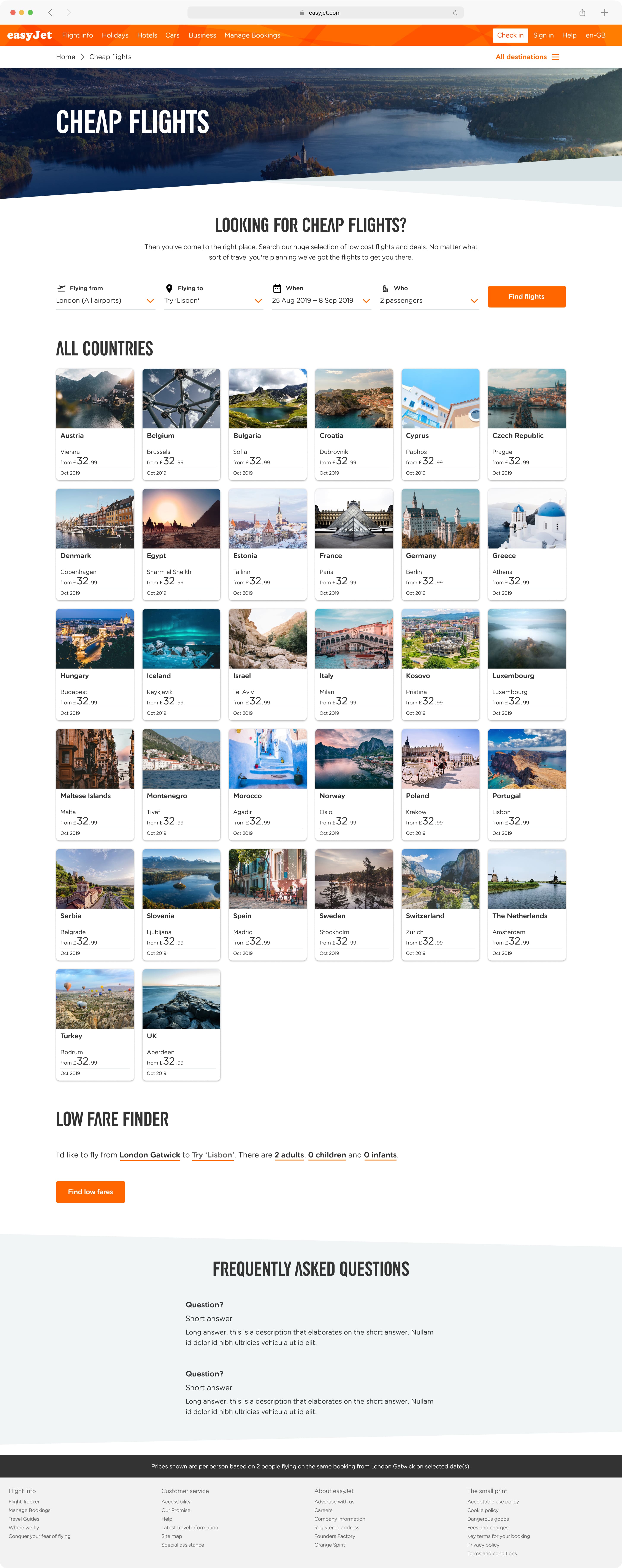
Hub

Country

City

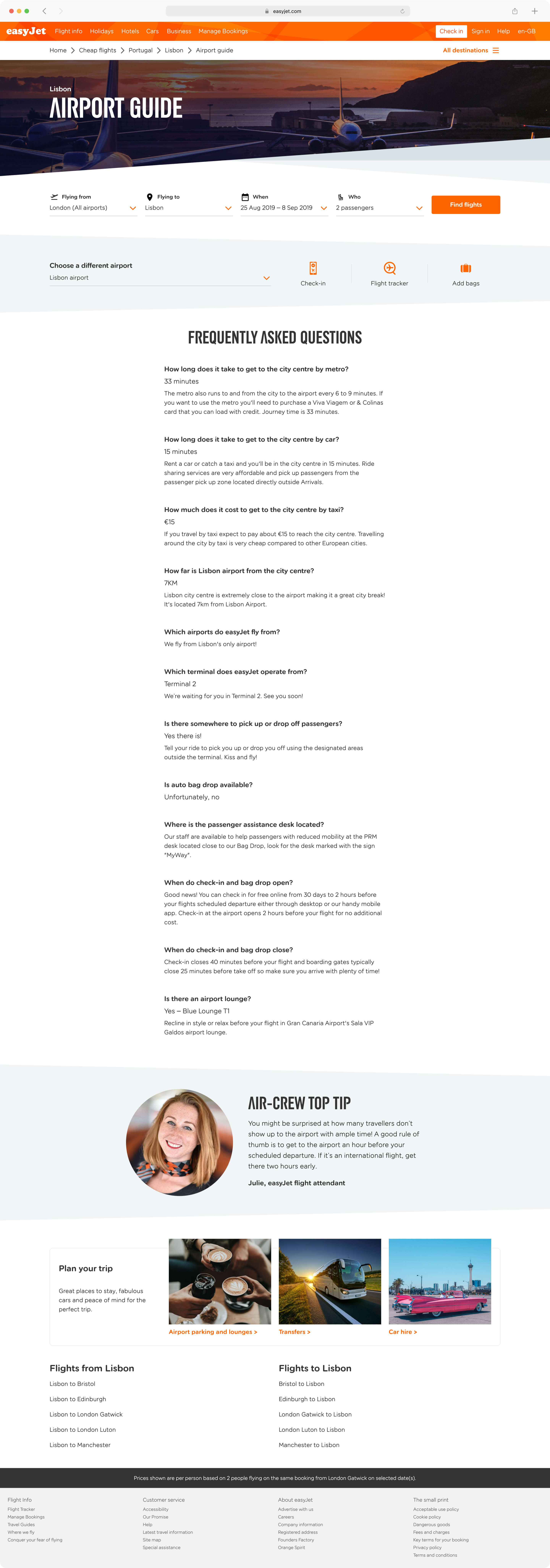
Airport Guide

Large layouts – Full pages
Hub
Country
City

Airport Guide
More of my work
Lily’s Kitchen International TemplateUI & UX project for Lily’s Kitchen
Mercedes-Benz interactive displayUI & UX project at Digital Annexe
The Mall’s RewardMe appUI project at Digital Annexe
Evans’ iPhone appUI concept for Evans
